This is a getting-to-know-you project I used with some second graders at a school I'm working at temporarily. They are great kiddos and VERY enthusiastic artists! It was fun to see what they drew on their "winter walk through the woods" (snowmen, critters, cabins, and more) and the lovely skies they created! Even though it was 15 degrees outside, we could take a walk in the woods and stay nice and warm!
This project is from Mrs. Knight's Smartest Artists...I should have had them add paint dots for snow in their skies as well---ah, NEXT time!
ENJOY!
VOCAB: landscape, foreground, background, perspective, scale
CROSS-CURRICULAR CONNECTION: science (the seasons/winter)
MATERIALS: 9x12" white drawing paper, gray crayon, black crayon, watercolor paints (I used biggie cake paints I found in the art room), brushes.
This blog is a resource for educators and parents who wish to explore the world of art with the children in their lives. Have fun, create and learn something new--together!
Showing posts with label perspective. Show all posts
Friday, March 4, 2016
Saturday, August 29, 2015
Grade 6 Oil Pastel Fauve Landscapes
Well, I fell in love with these great oil pastels I found in art room of the middle school I was working at. They are chunky and water soluble--Um, hello!?! Water soluble OIL pastels? I do not understand the mysteries of the world, but I must say, my students and I used the bejeebies out of these last semester!
One great project the 6th graders worked on was Fauve landscapes. I have posted a Fauve Landscape project before which was more technical and science-oriented since it involved afterimages and such (check it out here--it makes a grew STEAM project). But this time, I went with a simpler version that still allowed the students to learn about the Fauves and color theory. These came out beautiful and made a wonderful display, but I didn't get a picture of them all together (I know, I can't believe it). Trust me, they are awesome and beautiful. :-)
Here's how it worked:
Students looked through the magazines in the classroom for three landscapes they liked that they thought would work to simplify--these oil pastels don't do detail well. The students met with me and we discussed their choices and they selected one to take to final. They could then simplify the landscape on newsprint using a grid format (or freehand it if they preferred).
Once they were done their draft, I had them transfer the image to a poster-weight paper. I thought that would hold up well. However, you could probably use white drawing paper. Students were encouraged to use at least two colors in each section of their drawing using blending. We had talked about color theory, warm/cool colors and atmospheric perspective so they could make great color choices. Once all of the sections of their landscape were complete, they could use a dark-colored pastel to outlines the sections (similar the some of the Fauve artists).
When done, the finished pieces were glued to a black mat (black paper cut 2" larger than the work). This really made the colors seem so bright and also made the pieces look more finished. Matting work just makes it seem more special.
Ta-da! Beautiful Fauve Landscapes! ENJOY!
![]() |
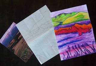
This shows the stages of the project: Image selection, simplified sketch and completed Fauve Landscape. |
One great project the 6th graders worked on was Fauve landscapes. I have posted a Fauve Landscape project before which was more technical and science-oriented since it involved afterimages and such (check it out here--it makes a grew STEAM project). But this time, I went with a simpler version that still allowed the students to learn about the Fauves and color theory. These came out beautiful and made a wonderful display, but I didn't get a picture of them all together (I know, I can't believe it). Trust me, they are awesome and beautiful. :-)
Here's how it worked:
Students looked through the magazines in the classroom for three landscapes they liked that they thought would work to simplify--these oil pastels don't do detail well. The students met with me and we discussed their choices and they selected one to take to final. They could then simplify the landscape on newsprint using a grid format (or freehand it if they preferred).
Once they were done their draft, I had them transfer the image to a poster-weight paper. I thought that would hold up well. However, you could probably use white drawing paper. Students were encouraged to use at least two colors in each section of their drawing using blending. We had talked about color theory, warm/cool colors and atmospheric perspective so they could make great color choices. Once all of the sections of their landscape were complete, they could use a dark-colored pastel to outlines the sections (similar the some of the Fauve artists).
When done, the finished pieces were glued to a black mat (black paper cut 2" larger than the work). This really made the colors seem so bright and also made the pieces look more finished. Matting work just makes it seem more special.
Ta-da! Beautiful Fauve Landscapes! ENJOY!
Wednesday, February 6, 2013
Tints Landscape With Charcoal
I love working one-on-one with students! It's just the break I need in my week. I get to focus on art and one person and really enjoy both!
Today, my 3rd grade private art student finished this beauty. I am so proud of her! I had originally seen this post called "Winter White Landscape Paintings" at the blog A Faithful Attempt and loved them! The landscapes are done in tints of blues (in tempera!) and then the details added with charcoal pencils. LOVE IT! Honestly, I didn't think of temperas as a serious art paint, but I am so glad we tried this. I have completed my own piece and have another in the works--they are pretty addicting to create!
So, enjoy my student's work and hop on over to A Faithful Attempt to see how her students did it--and try one for yourself! You'll be glad you did!
With this project, my student learned:
• Color that are mixed with white are called "tints" and there can be many tints of a color!
• How to select a composition to paint (visual interest, balance, value range, etc.)
• How to use opaque water-based paint (tempera) to paint a landscape in layers and in multiple steps that require planning
• How to add details and value to a piece using charcoal pencils and the different ways of applying them as well as grades of softness
• One point perspective (fence) and direction of light and its effects on the shadows in a composition
Labels:
a faithful attempt,
charcoal,
color,
drawing,
landscape,
middle school,
painting,
pencil,
perspective,
shadow,
tempera,
tint,
tints,
value
Tuesday, June 26, 2012
Follow-up: 3D Wire Sculpture
One of my 13-year-old private art students created a wonderful sculpture from pantyhose and a coat hanger and it came out so incredibly cool! I wish I could do this project with ALL of my students! I originally showed this project here while it was in-the-works. These sculptures do take a while to make--she worked on it during a few of our sessions together (a coat of gesso here, a coat or paint there...). But finally, it was done!
She chose to paint her sculpture with a bright red acrylic paint (3 coats) and we finished up with a coat of Mod Podge to add a bit of sheen and seal it up. While the Mod Podge was drying, we used the opportunity to sketch the sculpture from a variety of angles and with a few different types of drawing media.
I brought out the very large newsprint I have and we practiced drawing BIG and loose trying to get the feel of the sculpture and the lines and movement with our sketchy lines. Some children have a hard time with being "sketchy" with their drawing--a few timed drawings (each about 2 minutes) and some vine charcoal usually loosen them up.
We then tried sketching the sculpture from other angles working with charcoals and conté crayons in various shades of grey, black and brownish-reds. Some of the media lent itself to sketchy, loose drawing (vine charcoal and traditional, chalky, pastels), while other media allowed my student to create hard edges. I really stressed that these drawings were just sketches--they needn't be museum-quality--the more you draw, the more you learn.
This was also a wonderful project to discuss value and contrast and perspective (the base of the sculpture needs to "lie flat" in the drawing. This was a great lesson and the results were wonderful! ENJOY!
Friday, March 16, 2012
One Point Perspective Paintings
The focus of this year with my home school art class is art from the 1500's-1700's. One of the things I really wanted to teach them about was perspective, but I felt like a couldn't quite find a project that would work for 2nd-5th graders that wouldn't turn into a circus! So I put it off and put it off, but then I saw Natalie's project on one point perspective at the blog, "SmArt Class," and I thought, "This just might work...."
Well, I'm happy to say, it did! The first week, I showed the students some examples of paintings with and without perspective in them. Then, I walked the students through a guided drawing exercise using Natalie's step-by-step instructions so I didn't miss anything.
The second week, the children finished their pencil drawings (most of them were still drawing windows on buildings) and added details for interest. Then they used Sharpies to ink their drawings. When done, they used erasers to remove their guide lines. I gave a demo on using watercolors properly. Rules I shared were:
This student has lots of lovely details in her picture! |
Well, I'm happy to say, it did! The first week, I showed the students some examples of paintings with and without perspective in them. Then, I walked the students through a guided drawing exercise using Natalie's step-by-step instructions so I didn't miss anything.
The second week, the children finished their pencil drawings (most of them were still drawing windows on buildings) and added details for interest. Then they used Sharpies to ink their drawings. When done, they used erasers to remove their guide lines. I gave a demo on using watercolors properly. Rules I shared were:
- proper brush technique
- no splashing the water
- dabbing brushes dry on paper towels
- no scrubbing the brush
- how to create areas of color by using gradual washes of color, etc...
Most of the students were able to start their painting on week two.
The third week, students continued to add color to their pictures with watercolors. Everyone finished up by the end of this class.
The students were very proud of their pieces--they kept saying things such as, "It really looks like you can go down the road!" I was very happy I tried this project with my students!
Love the bridge and the car in this one! |
Even the youngest students in my classes really got into this project! |
Subscribe to:
Posts (Atom)