Friday, September 28, 2012

Mini Hand Drawing With Pattern & Ribbon

Well, here's another project I saw on Pinterest only to follow the link to nowhere. If you know where this came from, let me know so I can give credit where credit is due! When I originally saw this project I thought it would be great for my 13-year-old private art student. It was, but I also modified it and had my 9-year-old student do it as well. Here are my notes and method:


This is a lovely project that encompasses a variety of art concepts: inking patterns, drawing hands, shading with colored pencils, depth, positive and negative space, and value (in the ribbon and in the patterns). But, in order to make it manageable, I suggest only drawing one hand on an oversize index card. This keeps the size relatively small and you should be able to actually get the piece done at some point. My 13-year-old student used a large piece of paper (maybe 11" x 14"?) and had two hands in the composition and divided up the space with lots of ribbons and she worked on it for over three weeks (each an hour long session) and it was only about 1/3 of the way done. It got to be pretty tedious for her, I think.

With this smaller format, you get all of the fun and it is just enough to keep it interesting. Here's how we did it:

Mini Hand Drawing With Pattern & Ribbon

Supplies Needed:
  • Oversize (6" x 9") white index card, blank (or card stock)
  • Pencil with eraser
  • Sharpies (fine and ultra fine tips)
  • Colored pencils, assorted colors
Directions:

1. Place the hand you don't draw with onto the index card. You can make the hand go off the page a bit, but extend your fingers so that the space around your hand is broken up a bit by your fingers. Trace your hand with pencil.

2. Move your hand off of the paper and use it as a model to fill in some of the details of the hand you traced on your paper. Add wrinkles, rings, bracelets and fingernails. Don't add too many wrinkles though!

3. Draw a ribbon curling around your hand or through fingers and take care to have the ribbon divide up the negative space in your piece. Make it interesting!

4. Erase the lines of your fingers where the ribbon overlaps them. You'll want to take a minute and really make sure that your lines make sense--you don't want to ink something that shouldn't be there!

5. Trace the hand and the details on your hand with the ultra fine point Sharpie. Also trace the ribbon with the Sharpie.

6. Use your pencil to draw different patterns in the different sections of the background. Patterns can be made of lines, dots, squares, triangles, zig zags, and more!

7. Once you have your patterns down, ink them in with the Sharpies.

8. Erase all pencil lines.

9. Use the colored pencils to add color to the ribbons. Once you've built up nice layers of color, use darker colors in areas to create shadows.

My 9-year-old art student created her piece in two one-hour sessions. I'd think that this would take 3-4 regular class sessions if you were doing this project in a classroom setting. 


Wednesday, September 26, 2012

Fall-Inspired Matisse Cut Paper Project

This project was inspired by Matisse's La Polynésie. I saw a similar project on the blog Ms. Sortino's Elementary Art Lesson Plan Page (it seems this blog is now defunct).


We talked about different fall icons: pumpkins, apples, gourds, leaves, acorns and what colors remind us of fall: orange, brown, yellow, gold, red (and some said black).

We then created artwork combining those shapes and colors made entirely with cut paper and scissors (no drawing first). I told the children they could either place one object in each section of the background or make the shapes floating all over, like Matisse did. BUT, they needed to create at least 8 shapes and they needed to be different sizes: some small, some medium and some large.

This would also be a cute Halloween project, and could be done on a smaller scale (on a 9" x 12" piece of paper instead of a 12" x 18").

Fall-Inspired Matisse Cut Paper Project

Supplies Needed:

  • One 12" x 18" piece of construction paper for background
  • One 9" x 12" piece of construction paper for background
  • Scissors
  • Glue stick
  • One 12" x 18" piece of construction paper for border and shapes


Directions:

1. Fold the 9" x 12" piece of construction in half lengthwise and then again widthwise and cut on folds to create four equal rectangles. Glue to 12" x 18" background paper to create a checkerboard pattern.

2. Fold the other 12" x 18" piece of construction paper in half widthwise and, starting at the fold, cut about 1" away from the edge all the way around to create a border for the piece.

3. Glue the border to the background using a glue stick.

4. Use the construction paper left over from making the border to create the eight fall-inspired shapes for the piece. Attach them with glue stick to the center of the piece either one per box or floating all over the background.


Tuesday, September 25, 2012

Degas in Motion

This project is adapted from a lesson I saw in the book "Discovering Great Artists" by MaryAnn Kohl  and Kim Solga. While this project is quick and simple, it really illustrates the idea if movement in art.


Car moving across the page...
We started off by brainstorming different ways to show an object moving in a drawing or painting. I asked the children to draw a ball bouncing in their sketchbooks. Some drew a round ball with a line on the page showing the path the ball had traveled (kind of like in a cartoon). I told them that this was a way to given the idea of movement, but it was more of a thinking way of interpreting movement. Our brain knows when we see a line like that, the artist is trying to depict how the object traveled. BUT it doesn't SHOW movement. Other children used repetition with value to SHOW movement. They drew multiple copies of the ball with the drawings getting lighter in value the further they were from the real ball. This gave the visual illusion of the path the ball had traveled and, in doing that, allowed our eyes to follow that path and move, visually, across the page.

If you look at the paintings and drawings Degas did of racehorses and dancers, you can see he used repetition and value. Degas would often repeat the image of the horses' legs and the folds of the dancers' skirts many times which gave the illusion of movement. He also repeated entire forms throughout a painting to lead the viewer's eye throughout the piece--so we could take in all that was going on within the painting. He was a pretty smart guy!

A great children's book about Degas is "Edgar Degas: Paintings That Dance," by Kristin N. Cole and Maryann Cocca-Leffler. This wonderful book about Degas is great for illustrating the concept of motion in Degas' work.

Motorcycle flying off a jump...

Degas in Motion

Supplies Needed:
  • One 3" x 5" index card (blank, no lines) or card stock
  • Pencil and eraser
  • Sharpie marker, black
  • Scissors
  • Crayons
  • One 9" x 12" piece white construction paper or other heavyweight paper
  • Masking Tape
  • Newspaper or cardbaord
  • Paintbrush
  • Tempera paint, we used black, blue or green
  • Cup for paint
  • Colored pencils, optional
  • Glue stick
Directions:

1. Draw an object that moves onto the index card. Make sure it isn't too detailed and it takes up most of the index card, since you don't want to have the children drawing a bug that is about the size of a dime!

Some objects that work well are: a butterfly, a ladybug, an airplane, a submarine, a truck, a motorcycle, a superhero, a surfer, a skateboarder, etc.

2. Use the Sharpie to outline your object and fill in some of the details with the Sharpie, if you'd like. These will be colored in later.

3. Cut out your object with scissors.

4. So, how would this object move? Is your submarine ascending or descending into the deep? Is your motorcycle taking a jump? Is the butterfly moving diagonally across the page? Place your object onto the page and trace around it with crayon. Then move the object a bit and trace it again (you can use the same color crayon or a different color). The tracings should overlap slightly and move across the page in the way the real object would move. I told the children they needed to trace their shape about 5 times.

Make sure the crayon lines are nice and thick (you may need to go over them again).

5. Once you are done tracing your object, tape your paper to a stack of newspaper or a piece of cardboard to keep it flat. Thin a bit of tempera paint with water and paint a nice wash over the entire surface of your paper. The crayon lines will resist the paint so you'll be able to see them still.

6. While this is drying, use colored pencils to color in your object you drew on the index card.

7. When the background is dry, use a glue stick to attach the colored in object to the background along the path of movement. It now looks as though your object is moving across the page!

Ladybug scooting across a picnic blanket...

Saturday, September 22, 2012

Focal Point Fruit Print Tote

Fall is in the air! And for those of us in New England it's apple picking time! I took the kiddos out and we picked a HUGE bag of Cortlands, Macouns and (my favorite) Honey Crisp apples. YUM! This is also a wonderful time to do an art project that is a lesson in basic printmaking techniques, using fruit to make prints.


One of these things is not like the other...

Variations of this lesson abound, but with this one, you can use apples or pears to make a fall-inspired tote bag to carry all of those library books around! If you don't want to go through the expense of printing on canvas totes, just use tempera paints on heavy-weight paper.

In her book "Teaching Art With Books Kids Love," author Darcie Clark Frohardt has a similar lesson. She uses fruit prints to illustrate the concepts of focal point and dominance to students. She suggests using the book "Saint George and the Dragon" by Margaret Hodges--which has gorgeous illustrations, by the way, to show the concept of focal point and then stamp the fruit onto the surface with one of them being a different color. That different colored fruit becomes the focal point of the piece.

No matter how you choose to do this project, it is fun way to explore printmaking!

Focal Point Fruit Print Tote

Supplies Needed:
  • Canvas tote (or heavyweight paper)
  • Fabric Paints in two colors for the fruit (red and green or green and yellow, etc.)
  • Brown or black fabric paint for seeds and stems (or you could use a Sharpie marker if you are doing this on paper)
  • Fruit such as a pear or apple (or experiment with whatever fruits and veggies you have on hand)
  • Knife (to cut fruit, a grown-up's job)
  • Paper plate palette
  • Newspaper to cover work surfaces
Directions:

1. Cut your fruit in half using a sharp knife (a grown-up's job).

2. Place some fabric paint on a paper plate. Dip the fruit into the fabric paint and try a test print (or two) on paper. Once you've got the technique down, you can stamp the fruit in rows across the tote. To make the focal point, use an alternate color of paint to stamp one of your fruit a different color than the rest.

3. Use brown or black fabric paint with a fine tip to add details like seeds and stems to the fruit. I didn't add seeds to the focal point fruit because I thought that made it look like it wasn't cut open but the rest were.

4. Let dry for at least 24 hours (or whatever the fabric paint manufacturer suggests).

A variation of this would be to use any of the books by Saxton Freymann and Joost Elffers such as "How Are You Peeling: Foods With Moods" and after your initial fruit prints are dry, add faces to them expressing different feelings and moods. FUN!


Wednesday, September 19, 2012

Fun With Juan Miro


I just did a fun project with one of my private art students where we looked at the fanciful art of Juan Miro. 

"Midnight Masquerade" Inspired by Miro

His artwork is made up of cartoon-like creatures and has limited colors, but the colors that are used are bright. It can be hard for a child, who is used to drawing from life, to break away and surrender to drawing squiggles and weird shapes, but it's a wonderful exercise in letting loose and having fun with art. In order to free us up so that we didn't draw anything too recognizable, we used a chart and rolled a die to randomly choose the elements that would appear in our pieces. This is the chart I found on Pinterest and it doesn't link back to any site (SIGH). I hate that! If anyone knows where this chart came from, please let me know so I can credit the creator.

When creating the piece, I had my student focus on composition and scale. The figures in our drawings did not have to be the same size, but she chose to make them that way. I think I would suggest, in the future, that the student create two to three figures (their choice) but one had to be larger than the others. I think that would make the piece more visually interesting and we could talk about how the size of the figures affects their relationship to one another and to the space.

As we worked we came up with a story about these creatures and what they were doing. This helped later on when we selected colors for the accents and the background.

We then inked the figures with Sharpies and added spots of color with bright oil pastels. This was a great opportunity to talk about balance and make sure bits of color appeared throughout the piece. We then finished the pieces off with multi-colored watercolor washes. We talked about tone and how the color choices in the background could reflect mood or time of day. For example, a piece that takes place at night might have cool, dark colors whereas a piece that depicts a happy moment may have bright, warm colors. We then made up great desciptive titles for our pieces and wrote them on the edge of the work.

Miro is not for everyone, but it was fun to try something different and fanciful! Enjoy!

"The Wizards Making Magic in the Night"
by my student age 9

Art and the ABC's of Ecology

I was asked to spend some time with 4-year-olds and talk about ECOLOGY. I said "YES!" and then ran to my computer to look up what "Ecology" was!

Ecology is: 1. the branch of biology that deals with the relations of organisms to one another, and 2. The study of the interaction of people with their environment.


You'd "B" Crazy Not To Try This Recycling Craft! (GROAN!)

I started off having the children play with blocks. We talked about how we needed to share the blocks. If one person took all of the blocks, there wouldn't be enough for everyone. This is a good way to illustrate the concept of REDUCE. If you use less, everyone can have some. Then I talked a bit about how people and nature can be connected. If we go on a picnic and throw our trash on the ground it will dirty up the environment and outside is where animals live--it is their home! Imagine our homes filled with trash! YUCK!

So we went outside with a shopping bag and looked for trash. They were good at that game and found quite a bit! We also talked about biodegradable vs. non-biodegradable. Leaves will break down over time, but a plastic coffee cup will not.

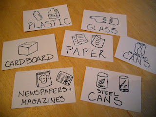
We went back inside and I introduced the next concept: RECYCLE. If we threw everything away or landfills will fill up quickly, and some of the stuff we throw away is still good or can be turned into something else. For example, water bottles can be turned into Polar Fleece fabric. I had a bunch of different recyclables on hand, in a pile, to show them. I had a ton of categories for them to sort the recyclables into (our town has a wonderful recycling center!). I had seven bins with labels such as:
  1. Paper
  2. Plastic
  3. Cardboard (Corrugated)
  4. Steel Cans
  5. Aluminum Cans (Soda cans)
  6. Newspaper/Magazines
  7. Glass (be careful with that!)
Here are my basic labels for the Recycling Bins

Then they sorted the recyclables into the appropriate bins. This went quite fast! I explained that other things can also be recycled: clothing, books and toys, by giving them away to someone who may need them.

On to the art project!

Recycled Letters

Supplies Needed:
  • Poster board (we used black)
  • Scraps of construction paper, magazines, newspapers, labels from cans, etc.
  • Glue stick
  • Scissors (young children can rip the paper if they aren't ready for scissors).
Directions:

1. Cut the first letter of the child's name from poster board. It should be about 10 inches tall and wide enough so that s/he has space to glue paper to the surface.

2. Have the child use the glue stick to attach bits of paper to the surface of the letter.

This project REUSES paper that normally would have been thrown away.

We then went back to the pond onsite and looked for trash and critters. We found water bugs and a frog and we also saw trash that we couldn't reach, floating in the pond, such as a tennis ball. This allowed me to reiterate the information I had talked about earlier about how humans and nature are connected and how our actions affect other living things.

Home Connections

To strengthen the learning this lesson at home, parents can do the following:
  • Discuss with children how they can be kind and not so kind to the environment.
  • Set up a recycling station at home and visit the Recycling Center in their town.
  • Look through outgrown toys, books and clothing and donate the items to those in need.
  • Go on a hike and/or picnic and be good stewards by staying on the paths and carrying out their trash and disposing of it properly.


Sunday, September 9, 2012

Mondrian Art Portfolios

My homeschool art classes start up again this week! I'm so excited! This year's focus for the homeschool cooperative is the 1800's to today. That means, in art, we'll be exploring Modern art. It was so difficult for me to narrow down all of the wonderful artists and art movements that occurred during that time into 20 art lessons for the year. But I made list after list and contemplated and rearranged and now I'm fairly sure I have the curriculum down pat. Really. I do!


Mondrian-inspired art on a portfolio

So, now let's talk about the end of the year. Wait, WHAT?! No, seriously. There are a couple of things I need to keep in mind when doing my planning for the year and the biggest one occurs at the end of the year...

In the Spring, the homeschool cooperative holds a Grande Finale. It's a time when all of the big kids are honored for their achievements and there are plays and demonstrations and displays to check out. This is also the time when I have my students display their artwork from the year. One thing I learned VERY quickly (and for some of you, you may say "duh!" when you hear this): If you send artwork home you will never see it again. As a teacher this makes for a lame show at the end of the year. So this year, I thought I'd have the children create portfolios (folders) in which to keep their artwork during the semester. I already send out weekly emails letting parents know what we did in class, so they know we are doing something. This way I can hold onto the artwork for a bit and get a chance to photograph it.

Why photograph the artwork? Well...more on that later! I have a plan, my friends! But first, the portfolios! I decided to take one of the easy lessons I wanted to do and combine it with making the portfolios. This way, we can decorate the portfolios and learn about an artist! Mondrian was an easy choice for me, but feel free to substitute whichever artist you would like!

A Mondrian-inspired lesson is a good first lesson of the semester since it allows us to talk about basic art concepts such as:

  • line (vertical and horizontal)
  • shape (geometric, squares and rectangles)
  • color (primaries: red, yellow and blue)
  • balance

Mondrian Art Portfolios

Supplies Needed:
  • 1 Sheet of white poster board, 22" x 28" (i bought mine at the dollar store for 50 cents)
  • 1 Sheet of graph paper, 8 1/2" x 11"
  • Glue Stick
  • Masking tape
  • Electrical tape, black
  • Markers in Red, Blue and Yellow
  • Black Sharpie Marker
Directions:

1. Fold the poster board in half to make a 14" x 22" pocket. Seal the side seam with masking tape.

2. Use the glue stick to attach the graph paper to the poster board. 

3. Use the electrical tape to create a border around the edge of the graph paper, then use more electrical tape to divide the graph paper into smaller squares. Use the grid on the graph paper as a guide for the tape.

4. Color in some of the squares and rectangles you created with the red, yellow and blue markers leaving some of the sections white.

5. Write your name with the black Sharpie on the upper right corner of both sides of your folder. The front side of your folder (the side with the artwork) is for decoration, but the plain side (the side with only the student's name on it) is a nice backdrop for photographing the students' artwork--their name is written in the upper right hand corner, so you can include that in the photo and it makes identifying the artwork in photos much easier later on!

An example of student work photographed on the reverse side
of the folder. I included the student's name in the photo
and I can crop it out later if I need to.
You could also include teacher name or class session info or the school year on the blank side under the student's name. Whatever works for you! Here's to an organized school year!


Saturday, September 1, 2012

Clay and Paper Butterflies

Do you know some students who are studying butterflies? This is a great project for children in Kindergarten and elementary school. You can work in so many great concepts with this project: parts of an insect, symmetry, pattern, and more.


I started by having my students cut out the wings and design them and then I walked them through the making of the butterfly body. We finished up by adding the details such as antennae and legs. I really enjoyed this project because it taught science and art concepts, but it also because it allowed the students some self expression; a win/win in my book!

Clay Butterfly With Paper Wings

Supplies Needed:

  • One 6" x 9" piece of construction paper for the wings (light color)
  • Pencil with eraser
  • Scissors
  • Assorted markers
  • Model Magic by Crayola (about the size of a chicken egg), whatever color you want
  • 3 pipe cleaners (chenille stems), whatever color you want

Directions:

1. Fold the construction paper in half the short way (hamburger or taco fold).

2. Arrange the construction paper so the fold is on the left. Draw a capital letter "B" on the paper extending it so the top and bottom of the "B" touch the top and bottom of the paper.

3. Cut out the "B" shape, but don't cut the middle line (in between the upper and bottom bumps). Write your name on the paper and open it up so your name is face down. These are your butterfly wings.

4. Decorate the wings with whatever designs you would like: big dots, little dots, lines, etc. I showed a couple of butterfly books to the children before they started drawing. I asked them to make their designs symmetrical, or the same on both wings.

5. I then gave each child a ball of Model Magic the size of a chicken egg. I had them pull off a piece and roll it into a 3/4-1" ball. This is the butterfly's head. Place this ball of dough at the top of your butterfly's wings and press down slightly.

6. Divide the remainder of the dough in half (two equal parts). Form he first into a ball. This is the thorax for your butterfly. Place this ball of dough below your butterfly's head on the wings and press down slightly.

7. Roll the remainder of the dough into a hot dog shape about 3" long or so. This is the abdomen of your butterfly. Place this ball of dough below your butterfly's thorax on the wings and press down slightly.

8. Use scissors to cut each pipe cleaner into three equal sections. Poke 2 pipe cleaner pieces into the butterfly's head as his antennae. Wrap another pipe cleaner piece into a coil and poke it into the head for the butterfly's proboscis.

9. Poke the remaining 6 pipe cleaner pieces into the butterfly's thorax (3 on one side, 3 on the other). These are the butterfly's legs.

You're done! Enjoy your colorful butterfly!

Related Posts Plugin for WordPress, Blogger...