Showing posts with label watercolor. Show all posts

Thursday, July 29, 2021

Six F's of a Great Classroom Manager

Nobody wants a big ol' "F" in their sketchbook, but I have one and I'm loving it!!

I've pledged to follow more inspiring people on Instagram lately--filling my feed with positivity! Somehow that includes LOTS of guinea pig photos where they are dressed up and riding in remote control jeeps. Not sure how the IG algorithm works, but I like it!! How can you have a bad day after watching a guinea pig video?!


Anyhow, one of the amazing people I began to follow just today is Dr. Marcia Tate (@drmarciatate). She has all sorts of  positive messages for teachers--and we all need that!

One that stuck out as I was scrolling through her feed: The 6 F's of a Great Classroom Manager. They are:

  • Be Fair
  • Be Firm
  • Be Flexible
  • Be Fun
  • Be Friendly
  • Be Forgiving
Absolutely LOVE this. Right away, I knew I had to put it in the new journal I've started. The 6 F's are so affirming to me--I'd say that this is how I am as a mom and as a teacher. In my opinion, you have to be all of these dealing with middle school and high school students. This doesn't mean my classroom and home is out of control--although some may question that. 

I think I run a pretty great classroom and home, but I also strike a nice balance between fun and work and most times work can even be fun (shhhhhh.....)! When students know you care about them--truly--they will work harder for you, care about their work, and behave better. Truly. 

So this is going in the journal and I'm gonna look at it when I need the inspiration. And since I'm following Dr. Marcia Tate on IG, I'll have a lot more positivity in my future IG feed!

Supplies: Prang watercolors (16 colors), Pigma Micron Pen (PN)

Sketchbook Art (aka Art For Me): Sour Puss

 I'm enjoying the freedom of creating art for myself these days. Throughout my day, I look around and get a spark of creativity and just go with it. That happened with this sketch. I was enjoying my pink lemonade and thinking about how much I like pink drinks (what can I say?). 

And I thought about all of those stickers my students have on their water bottles.

And I thought of a lemonade sticker.

And then I thought of the term "Sour Puss" which my kids didn't even know! :-0 By the way, it means having a sort of grouchy disposition, in case you didn't know either. 

Anyway, I stopped folding laundry (always willing to do that!) and started this sketch.

When I was done, my paint water looked the same as my glass of lemonade!

So, don't be a sour puss today! Have some fun!

Enjoy!

Supplies: Winsor newton watercolors, ultra fine point Sharpie marker

Wednesday, July 28, 2021

Sketchbook Art (aka Art For Me): So Do It!

Enjoying being back home and thankful I have such a lovely deck area to hang out on every morning. Sipping my coffee, writing in my journal and sketching.

I hung an old window up out there and love the look of it. Also got easy-care Boston Ferns this year, knowing full well, I will bring them inside my house this fall and keep enjoying them.


Took a few minutes to create a quick sketchbook snapshot of those lovely things. It needed a quote (I LOVE quotes!) and saw this one by Kurt Vonnegut. So often I make something and start critiquing. 

Used the color swatches from the quote
to create beautiful blocks of color
and then doodled on top using Sharpie and paint marker.

I am also doing a 5-day online course by the Art Class Curator and she referred to another podcast I want to check out (Full Frontal Living) who says:

"Judgement and Curiosity Cannot Co-Exist"

I'm on this journey to create this summer. My goal is not to create finished art that is going to be in a museum. I'm creating for me. My journal. My sketchbook. My self care. It's time to create and there really isn't room (or time) for judgement. Not right now. 

I need to follow this process where it's going and just BE. 

What would YOU create if you didn't have to worry?

So do it!

Enjoy!

Supplies: Winsor Newton watercolors, Sharpie, Studio Series acrylic paint marker (white) by Peter Pauper Press

Saturday, July 3, 2021

Watercolor Necklace & Cricut Love

One thing about watching kid shows with your kid is that you get to see all sorts of fashion for the younger set. A couple weeks ago we were watching "Nicky, Ricky, Dicky and Dawn" on Netflix and their friend Mae (who's like 10, mind you), was wearing this awesome geometric watercolor necklace. 


I sat up and took notice! WOAH! As an art teacher, watercolorist AND funky homemade jewelry-wearer, I WANTED THAT NECKLACE!!

But how? I searched the interwebs to see if I could find it--or anything like it, but, nope. So I started plotting, I mean, making a plan...I wanted something sturdy and the edges needed to be sharp and clean. My son has a 3D printer, but the thought of plastic poking me made me sad. And trying to get a 19-year-old boy to get all hyped up about jewelry and design his mama something ASAP might be tricky and involve lots of bribery.

And then, I got the Cricut machine I ordered. I splurged (for me) on the Cricut Explore Air 2 Everything Bundle from Cricut.com. I wanted lilac but waited too darn long and needed to get the mint. Also an OK color (but I looooooove lilac. SIGH.). 

Anyway! I was scrolling through the Cricut Design Space, teaching myself how to do simple projects to get acquainted with the machine and (cue angels singing) I saw the necklace! OK, it was teal and full of holes where the watercolor bits should be, but you know what I'm saying!! And it had earrings!!! I love me a matching jewelry set!


So, I made it! It's multiple layers of black cardstock and one layer of Cotman Watercolor Paper (similar) I had painted with my favorite colors. The watercolors I'm using are professional grade and from my second time going to college (or maybe even my first--it was a summer class, so its hard to remember. SO let's just say, they are, AHEM, old). Just use the best quality watercolors you can if you are looking for something to last and stay bright. Then I mod podged the heck out of the layers. And then added more mod podge. Like a lot. Work on wax paper so that it doesn't stick to your work surface. 


Then I added findings (similar). This is another one of the projects I'm doing this summer that uses stuff I have on hand. I'm trying not to buy more stuff unless necessary to finish a project. We'll see who that goes!


I made both the original (full of holes) and my version. The earrings are full of holes and are meant to match both necklaces. 


I'm in love!!!

Supplies: 2-3 pieces of 12" square black cardstock, one 4"x6" piece of watercolor paper, watercolors, watercolor brush and supplies, Cricut machine and supplies, Mod Podge glossy, brush, waxed paper, jewelry findings in silver. 


Friday, January 29, 2016

Happy Birthday, Paul Cezanne! (On January 19th)

In honor of Cezanne's birthday, I thought I would REPOST a popular lesson from 2013 that is fun and easy and is appropriate for a wide range of students. The painting below is my youngest son's and was featured in the book "500 Kids Art Ideas" by Gavin Andrews published by Quarry Books. While this is a nice fall-inspired still life, you could change it to pears or lemons/limes for a more winter or spring theme. Either way, the results are fabulous and the lesson is chock-full of active learning.

-------------------------------

We are all into fall over here and I thought this week would be a nice time to do a still life with apples with my after school art class. This is the first time we've met this school year, and the group has 1st-4th graders in it. I had an idea of what I wanted to do, it's actually a combination of two lessons I saw out there:
My 1st grader's example with Cezanne's reproduction.
I can't show you the still life--he ate it!
(UPDATE: He's now in 3rd grade, but still eats still eats everything in sight!)

"Still Life With Oil Pastels and Baby Oil" (2 posts) from Fine Lines
http://kids-finelines.blogspot.com/2012/04/still-life-with-oil-pastels-and-baby.html
http://kids-finelines.blogspot.com/2012/04/oil-pastels-and-baby-oil-part-2.html

That was pretty much the lesson I used, but I modified my talk in the beginning to be about Paul Cezanne's work showing them "Still Life With Apples."

I then used the talk I found on That Artist Women: "Open vs. Closed Composition"
http://www.thatartistwoman.org/2011/09/open-vs-closed-composition.html

I really like how she shows real art examples in her post. I showed those to my kiddos as well.

Then I gave them time to experiment with arranging the apples (and one girl's donated pear) into closed and open compositions. There were three students to a table and the table needed to agree on a composition they liked best.

And then we were off! I walked them through drawing, demoed how to use the oil pastels and baby oil, and gave a quick watercolor demo.

These are their creations! Beautiful! They are so proud (me too!).

Enjoy!


Gifts From the Art 2012: Watercolor Pin

I just finished a two session mini course called "Gifts From the Art" where children can make three projects a session (a total of six gifts) for their families and friends. I did this course last year as well and it was a big hit. The class was comprised of 2nd-4th graders and I had 2-3 fabulous helpers each session. Doing this many projects a week is a bit crazy, so having good helpers is key. I try to keep things fun and moving along, but I definitely prefer my normal teaching routine where we focus on one project a week!

Here is one of the projects we did:

Aren't these just beautiful! I want to make these by the dozen!

Watercolor Heart Pin

When planning this course I try to think of gifts that can be gifted to a variety of people. A pin is a nice gift for a variety of ladies: mom, stepmom, grandma, aunt, cousin, babysitter. Here's my version that uses watercolors with a neat technique along with a few findings to create a lovely one-of-a-kind pin that is sure to be a hit!

Supplies Needed:

  • Two little pieces of watercolor paper (ours were about 2 1/2" x 3")
  • Pencils
  • Watercolors and brushes
  • Plastic wrap (maybe two 6" lengths)
  • Wooden heart shape (ours were 1 3/4" wide)
  • Scissors
  • Tacky glue
  • About a 14" piece of contrasting embroidery floss, optional
  • Hot Glue Gun and Glue sticks
  • 5" strand of copper wire
  • Various glass beads and/or word beads (I bought both at Michael's--the word beads are plastic, the other beads are glass).
  • Pin backing (ours were adhesive-backed so they were just peeled and stick-EASY!)
Directions:

1. Write your name on both pieces of watercolor paper. Wet most of the center of your paper and apply watercolor paint to the paper in nice, saturated color. Use a couple colors of paint and allow the water to blend the colors (wet on wet technique). Choose colors that are next to each other on the color wheel (analogous) so that the colors look nice when they mix. I suggested having the children create a reddish or purplish color combo on one of their papers and a greenish/bluish color combo on the other. Make sure the colors you are using are nice and saturated and while the paint is still wet, crumple up the plastic wrap and press it into the paint. Leave it there and let it dry overnight.

2. When the watercolor pieces are nice and dry, remove the plastic wrap and discard. Trace the heart shape onto the front of the watercolor paper in an area of the watercolor that you like. Cut the heart shape out. Use tacky glue to glue the watercolor paper heart to the wood form. Press for a couple of minutes until the paper no longer curls (you can also place the piece under a book or something to help it adhere better.

3. Wrap a strand of contrasting color embroidery floss around the heart, securing the ends with hot glue.

4. Attach one end of the copper wire to the back of the heart pin. Wrap it around to the front and add a couple of beads. If you are using the word bead, use it now. Keep wrapping the copper wire around, adding a couple more beads if you'd like. Make sure you only add beads to the part of the copper wire that is on the front of the pin--no beads on the back of the pin (a couple of my students tried that--but no one would ever see them that way!). Secure the end of the copper wire with hot glue.

5. Attach the pin finding to the back of the Watercolor Heart Pin and press nice and hard to make sure it sticks on there. 

What a beautiful pin--so artsy! Any mother would love to receive this! It was neat to see how different the pins came out. The children had lots of fun choosing their favorite watercolor swatch, floss color, glass beads and word bead. They took such care with each detail.


Friday, January 8, 2016

Still Life Self Portraits With 7th Grade

Self portraits can be daunting, but students can express themselves without painting a traditional portrait. This project is based on one that the art teacher at Amherst Middle School, Rachel Rouillard, does with her 7th grade students. Students learn about self-portraits (traditional and non-traditional) and then bring in three objects from home to arrange into a composition and paint. Rachel has the students use acrylic and paint a mini composition (I think 4" square on canvas board, if I remember correctly). With the group of 7th graders I had at the time, I thought I'd try having them use ink, watercolor and colored pencil--I think that combination offers students more control and they can still explore value and color-mixing using paint.


These photos don't seem to do justice to these pieces.
They are really beautiful in person!

We spent a good amount of time sketching and working on composition for these pieces so that they were dynamic. I did not specify the size for the final pieces and there was a nice variety of little compositions and larger ones. The only trouble I ran into with this project was having the students bring in items from home--that just didn't work well for some. I'm not sure how I would work that in the future (perhaps give them the chance to bring objects in, but if they don't they use objects from the classroom?).

Anyway, I was SUPER-impressed by the work the students did. I think some of them were too! Once these were on display, they generated lots of discussion and comments from the middle school students and teachers in the hallway outside of class. ENJOY!

I like the inclusion of body spray in this one. ;-)

Some students preferred to focus on one object at a time.
I like how this student worked the background as well
adding color around each object and a shadow below.

This student also wanted to have the objects separate because he felt they were easier
to read with some space between them. He did a nice job with the details
and these objects have a great deal of personal significance to him.
And here are more of the students' work from the display...

And even more! Finished pieces were mounted onto mat board.
I feel this elevates the work from ho-hum to a finished piece worthy of display
(and preparing work for presentation is one of the National Core Art Standards).


Monday, August 24, 2015

Not-So-Scary Self Portrait Project

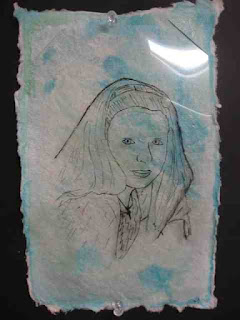
Many of my students dread the self portrait. I find that the older they get the more fear and loathing I see when I mention "self portrait." Not to fear! I was finishing up with last semester's 6th grade students and tried this neat twist on the self portrait from Dali's Moustache that uses clear acetate sheets (overhead projector film)--we had a surplus of them in the classroom, but I've also used sheet protectors (but those are more costly).


The students were pretty happy with the results, although some of them took a couple tries to get the hang of the drawing/tracing technique. We used watercolor paper and watercolors for our backgrounds.

I also saw this other version that uses collage for the background and I'm going to try that next time. Thanks, Janet Taylor for the awesome idea--I love collage!

ENJOY!!


And the bulletin board display of some of the completed self-portraits.

Friday, April 10, 2015

Catching up and 5th grade sculptures...

I've been offline for a bit because my life's been full and busy! I just began a long-term art substitute position at Amherst Middle School in Amherst, NH! The semester was changing over right when I was being trained so it has taken me a couple of days to focus and get used to it all. I'm teaching 5th-8th grade and I'm really excited about this semester and working with my students.


The intro class for 5th graders is a fun one and a long-standing tradition at AMS: plaster casts of the students' hands. The art teacher at AMS, Rachel Rouillard, walked me through the process. It's a bit messy, a bunch of fun, and it gets the 5th graders sitting really still for 10 minutes!

Students began by painting their hands with watercolors, if they wished. Once the plaster was mixed up, I scooped a yogurt cup size amount of gooey plaster into their cupped hands. Then, they waited about 10 minutes. While they waited I explained classroom procedures, etc. Once they unmolded their "sculptures" they could use the watercolors to add more color. On day two, we finished painting and then used the sculptures in a contour line drawing lesson.

They are pretty cool looking, and every one is unique--just like my students!


Saturday, October 12, 2013

Cezanne's Apples and Composition

We are all into fall over here and I thought this week would be a nice time to do a still life with apples with my after school art class. This is the first time we've met this school year, and the group has 1st-4th graders in it. I had an idea of what I wanted to do, it's actually a combination of two lessons I saw out there:
My 1st grader's example with Cezanne's reproduction.
I can't show you the still life--he ate it!

"Still Life With Oil Pastels and Baby Oil" (2 posts) from Fine Lines
http://kids-finelines.blogspot.com/2012/04/still-life-with-oil-pastels-and-baby.html
http://kids-finelines.blogspot.com/2012/04/oil-pastels-and-baby-oil-part-2.html

That was pretty much the lesson I used, but I modified my talk in the beginning to be about Paul Cezanne's work showing them "Still Life With Apples."

I then used the talk I found on That Artist Women: "Open vs. Closed Composition"
http://www.thatartistwoman.org/2011/09/open-vs-closed-composition.html

I really like how she shows real art examples in her post. I showed those to my kiddos as well.

Then I gave them time to experiment with arranging the apples (and one girl's donated pear) into closed and open compositions. There were three students to a table and the table needed to agree on a composition they liked best.

And then we were off! I walked them through drawing, demoed how to use the oil pastels and baby oil, and gave a quick watercolor demo.

These are their creations! Beautiful! They are so proud (me too!).

Enjoy!


Wednesday, January 30, 2013

Kandinsky Mixed Media Study

This past week was the beginning of semester 2 of Modern Art with my homeschool kiddos. I began with a great little get-to-know-you project I've posted before where the students move about to four different stations experimenting with different media and making color study pictures like Russian painter, Wassily Kandinsky. The students were required to make four squares (one in colored pencil, one in marker, one in collage and one with watercolor resist), but a few had time to complete 6 squares.

Here's the original post on the how-to of doing this projects with the four stations.

Enjoy!


Tuesday, December 18, 2012

Artsonia Ornament Picture How-To

I saw this project on Artsonia and thought my students would love to make this, and guess what? I did too! I made this along side one of my private art students and it was fun and easy and I love the contrast and graphic look of the piece.


Ornaments and Evergreen Picture

Supplies Needed:

  • Scraps of watercolor paper 
  • A circular object to trace--I used a glass (our circles are about 2 1/2" in diameter)
  • Pencil
  • Watercolor paints and brushes
  • White watercolor pencil or crayon
  • Water bucket and paper towels
  • Black mat board
  • Oil Pastels
  • Tacky glue
  • Gold and silver Prismacolor colored pencils
Directions:

1. Use the pencil to trace the circular object onto your watercolor paper about four to five times. Trace lightly. It is better to have a couple more circles than you'll use, just in case.

2. Use the watercolor crayon to add the highlights to each of the ornaments.

3. Wet the entire circle of an ornament. Use the watercolors to create juicy, saturated colors on the ornaments, letting the water blend the colors (wet on wet technique). Use your brush to blend the colors into the highlight a bit to soften the edges. Try to use three colors per ornament--choosing colors that are next to each other on the color wheel (analogous) so that they blend nicely. Repeat with all of the ornaments. Let dry.

4. Use the oil pastels to create the branches of the evergreens. I had my student start with the brown part of the branches. Use a chocolate brown first and rough in the branch. Then go over the branch with a lighter brown (like a yellow ochre) for the highlights. 

5. Use the oil pastels to create the needles of the evergreen. Start with a dark emerald green and rough in some of the needles. Then layer on the medium kelly green color for the bulk of the needles. Finally, use a light moss green for the highlights. Remember to make the needles start at the branch and curve toward the tip of the branch, the way real evergreen needles do.

6. Glue the ornaments onto the background. you may need to place a book on top of them to keep them from curling.

7. Use the gold colored pencil to add the top of the ornament (the finial?) and the hook. Use the silver to create a bit of highlight on the gold.

Merry Christmas!

Sunday, October 21, 2012

Starry Night, Step-By-Step

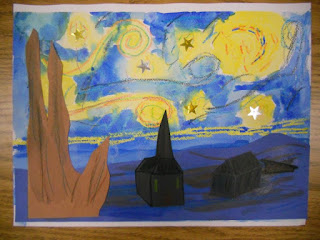
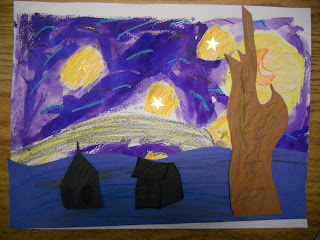
Van Gogh is one of the world's most famous artists and it seems that every art educator has his/her own projects already with which they introduce this fabulous artist. There are so many great projects out there and van Gogh's body of work is so large that it was hard for me to choose just one van Gogh-inspired project to do with my Modern Art class. I finally chose van Gogh's "Starry Night." While this is by no means a new and innovative project, I thought it was great. This is how I tackled it with my students:


The basic elements of a Starry Night: sky, buildings, hill, and tree.
We looked at a couple of books about the artist and noticed all of the colors he used in his paintings. We noted that sometimes his color choices didn't even make sense, like when he painted a sky pink! How unusual! We also noticed how he used little dashes or short brush strokes to add color and that our eyes mixed the colors in these areas. These short brush strokes also created movement in his work (similar to how the repetitive lines in our Degas pieces created movement). We also saw that he used VERY thick application of paint in his work--sometimes spreading the paint with a little spatula called a palette knife. WOW!

Poor Vincent sold very few paintings and drawings during his lifetime, because people of the 1890's didn't quite appreciate his vibrant colors. Today his paintings are some of the most famous and most beloved in the world (and sell for millions).

We looked closely at van Gogh's Starry Night and talked about our observations. We then had reproductions of the painting in front of us so we could see how van Gogh would create each section: sky, hill, tree, and buildings. Using the real painting as a guide allows the children to really see the work and bring their own pieces to another level. The children were required to use AT LEAST THREE COLORS in every section they were creating. That pushed them to think of color combos that would work for each section. Some of their color choices were amazing and inspiring.


Van Gogh-Inspired Starry Night

Supplies:
  • Reproduction of van Gogh's "Starry Night"
  • One 9" x 12" piece of watercolor paper
  • Masking Tape
  • Cardboard to tape the watercolor paper to
  • Gold and silver star stickers
  • Crayons 
  • Watercolor paints & brush
  • Water bucket & paper towels
  • Construction paper rectangles: Dark blue, 4 1/2" x 12"; Brown, 4" x 9"; Black, 4 1/2" x 6"
  • Scissors
  • Glue stick
Directions:

1. Tape the watercolor paper to the cardboard on all sides so that the paper doesn't buckle when wet.

2. Use the crayon to draw a moon on the watercolor paper. Make sure your crayon marks are nice a heavy because we'll be adding washes of watercolor and you want them to show up through the watercolor paint.

3. Put 5-6 silver and gold stars on the watercolor paper in the sky area. 

4. Use your crayons to add swirls and dashes all around the moon and stars. Use "Starry Night" as reference. Use at least three colors in these light areas.

5. Use dashes in the dark "blue" area of the sky. Use at least three colors in this sky area. Don't color in the entire sky area with crayon, you'll be filling in the sky in the next step. Keep pressing firmly with the crayon.

6. Once your entire sky has all of the dashes and swirls you want on it, use watercolors to add a yellow glow around the stars and moon. If the yellow is too much for you, dab the paint on the paper with a piece of paper towel. Then add blue paint to the rest of the sky. You can blend the yellow and blue areas of the sky to make a bit of green (that seems to happen in van Gogh's piece). Cover the entire paper with watercolor. The bottom couple of inches will be covered by your construction paper hills, but you don't want to have a gap where the sky ends and your hills begin. Set the sky aside to dry.

7. Create the ground: grab your dark blue construction paper rectangle (4 1/2" x 12"). Use a dark crayon to draw the hills for your painting. Using additional crayons, add dashes of color (at least three colors!) to the hills. You can use a bit of watercolor in streaks as well, but don't soak the paper. Cut the hills out and set aside.

8. Create the cypress tree: grab your brown construction paper rectangle (4" x 9"). Use a dark crayon to draw the tree for your painting. Using additional crayons, add dashes of color (at least three colors!) to the tree. You can use a bit of watercolor in streaks as well, but don't soak the paper. Cut the tree out and set aside.

9. Create the buildings: same deal as steps 7 & 8 above, but use the black paper rectangle (4 1/2" x 6"). You can use at least three colors here as well. The watercolor streaks and crayon will show up on the back paper. I had the children do at least two buildings. Cut them out and set aside.

10. Once your background is dry, glue the hill, tree, and buildings to it.

WOW! You're done! Great job!


Related Posts Plugin for WordPress, Blogger...