Showing posts with label oil pastel. Show all posts

Friday, April 29, 2016

Fourth Grade Projects From My Long-Term Sub Gig

Here are some of the projects from my long-term sub gig that appear in the collage here so that you had a bit more info on them...ENJOY!! For the background about where I've been/what I've been doing lately, scroll to the end of the post...


Ahhh...Monet's waterlilies--what's not to love?
For details on this project, scroll on down...

Fourth Grade Projects From My Long-Term Sub Gig:


Week 1: Winter Assemblage (1 day) Full post here.
A getting-to-know-you project inspired by Louise Nevelson.
Students worked individually or with a partner to create a folded paper “box.” Students then used strips of paper and various paper folding techniques to create a dimensional relief inspired by winter. Individual student work was mounted together to create a whole-class composition displayed in the artroom.
What a fun project--it ended up being a great whole-grade
project and allowed students to collaborate--something I'm a HUGE fan of! 
Week 2 through 4: Monet Relief Landscapes (2 days) An alternate form of this project can be found here.
Inspired by Monet’s Waterlily paintings
Students used oil pastels with short strokes or color to create the “impression” of the water, vegetation and flowers seen in Monet’s gardens. The "base" for these pictures was a 4" x 6" index card from the dollar store (cheap!).

On week two, students could add dimensional details to their work such as tissue paper water lilies. Pieces were mounted onto mat board and presentation was discussed. I had picked up some mat board scraps that were sized perfectly for this project. Check around your area to see if you can find a framer who'll give you some scraps--mounting students' finished work really makes a difference (and "presenting" is part of the National Common Core Arts Standards!)

These came out so nice! I had wanted to do a display of them for the hallway (complete with a HUGE postcard from Monet), but I was afraid little fingers would pick off the lily pad tissue paper flowers--and many of the students wouldn't part with them and wanted to take them home ASAP!)--that is also why I don't have lots of examples of their work (I can't teach and take photos at the same time!).

While I encouraged students to add tissue paper water lilies,
I didn't force them. I love how graphic this bridge it--
it really stands out!
This is one of my favorites. I love the addition of the fish--
it looks like a koi pond.
Students needed to completely cover the white of the card
and use MANY colors in every section. 
Week 5 and 6: I am a STAR Project From the great Cassie Stephens, y'all
We talked about what makes us special (a.k.a. a "STAR"). Students created a folded 3D paper star and used Sharpie to add designs to each section of their star. They then used markers to add color to each section. 

Once they were done their star, students used metallic markers to write why they are a star (why they are special) onto the background paper. Once the star was adhered to the background, students used chalk pastels to add accent colors to their background. 


I don't have any picts of the stars the students did,
but here's the "test" one I did with my daughter who is in kindergarten.
The fourth graders didn't get quite as much art time with me as the other grade levels did. One week, they were on field trips another week I was at the NAEA conference in Chicago. Bummed about that, but I enjoyed getting to know them and creating art with them!

----------------
Backstory for this post:

So, it's been a busy Spring for me since I finished student teacherin' in December--I subbed a bit in preschool, kindergarten, elementary and high school and then landed a wonderful 6 1/2 weeks long-term sub gig at an elementary school nearby teaching art to grades K-5. What a blast I had--the students and staff at Fairgrounds rock and I was sad to go (it's hard to stop doing something you love when your next big thing isn't settled upon yet). Since then, I haven't blogged much because I've been daily subbing and working on my dang art teacher portfolio (more on that in a future post or ten). Check the sidebar (over on the right side of the blog) for other posts in this series (k-5 at Fairgrounds Elementary School). ENJOY!!

Friday, January 29, 2016

Happy Birthday, Paul Cezanne! (On January 19th)

In honor of Cezanne's birthday, I thought I would REPOST a popular lesson from 2013 that is fun and easy and is appropriate for a wide range of students. The painting below is my youngest son's and was featured in the book "500 Kids Art Ideas" by Gavin Andrews published by Quarry Books. While this is a nice fall-inspired still life, you could change it to pears or lemons/limes for a more winter or spring theme. Either way, the results are fabulous and the lesson is chock-full of active learning.

-------------------------------

We are all into fall over here and I thought this week would be a nice time to do a still life with apples with my after school art class. This is the first time we've met this school year, and the group has 1st-4th graders in it. I had an idea of what I wanted to do, it's actually a combination of two lessons I saw out there:
My 1st grader's example with Cezanne's reproduction.
I can't show you the still life--he ate it!
(UPDATE: He's now in 3rd grade, but still eats still eats everything in sight!)

"Still Life With Oil Pastels and Baby Oil" (2 posts) from Fine Lines
http://kids-finelines.blogspot.com/2012/04/still-life-with-oil-pastels-and-baby.html
http://kids-finelines.blogspot.com/2012/04/oil-pastels-and-baby-oil-part-2.html

That was pretty much the lesson I used, but I modified my talk in the beginning to be about Paul Cezanne's work showing them "Still Life With Apples."

I then used the talk I found on That Artist Women: "Open vs. Closed Composition"
http://www.thatartistwoman.org/2011/09/open-vs-closed-composition.html

I really like how she shows real art examples in her post. I showed those to my kiddos as well.

Then I gave them time to experiment with arranging the apples (and one girl's donated pear) into closed and open compositions. There were three students to a table and the table needed to agree on a composition they liked best.

And then we were off! I walked them through drawing, demoed how to use the oil pastels and baby oil, and gave a quick watercolor demo.

These are their creations! Beautiful! They are so proud (me too!).

Enjoy!


Saturday, August 29, 2015

Grade 6 Oil Pastel Fauve Landscapes

Well, I fell in love with these great oil pastels I found in art room of the middle school I was working at. They are chunky and water soluble--Um, hello!?! Water soluble OIL pastels? I do not understand the mysteries of the world, but I must say, my students and I used the bejeebies out of these last semester! 


This shows the stages of the project: Image selection, simplified sketch
and completed Fauve Landscape.

One great project the 6th graders worked on was Fauve landscapes. I have posted a Fauve Landscape project before which was more technical and science-oriented since it involved afterimages and such (check it out here--it makes a grew STEAM project). But this time, I went with a simpler version that still allowed the students to learn about the Fauves and color theory. These came out beautiful and made a wonderful display, but I didn't get a picture of them all together (I know, I can't believe it). Trust me, they are awesome and beautiful. :-)

Here's how it worked:
Students looked through the magazines in the classroom for three landscapes they liked that they thought would work to simplify--these oil pastels don't do detail well. The students met with me and we discussed their choices and they selected one to take to final. They could then simplify the landscape on newsprint using a grid format (or freehand it if they preferred).

Once they were done their draft, I had them transfer the image to a poster-weight paper. I thought that would hold up well. However, you could probably use white drawing paper. Students were encouraged to use at least two colors in each section of their drawing using blending. We had talked about color theory, warm/cool colors and atmospheric perspective so they could make great color choices. Once all of the sections of their landscape were complete, they could use a dark-colored pastel to outlines the sections (similar the some of the Fauve artists).

When done, the finished pieces were glued to a black mat (black paper cut 2" larger than the work). This really made the colors seem so bright and also made the pieces look more finished. Matting work just makes it seem more special.

Ta-da! Beautiful Fauve Landscapes! ENJOY!

Thursday, August 13, 2015

Grade 5 Tooled Metal Lines and Patterns

My fifth grade students loved this great little project. We talked about different types of lines (dotted, straight, curved, dashed, etc.) and pattern. I gave the students four little 3 1/2" square pieces of white paper and they could create little compositions that included line and pattern.

Once they were done, they selected one of their compositions to tool into metal. This is a very neat media to work with and this relief technique is called repoussé which is French for "to push back." You can get the tooling foil online at Dick Blick. It is quite reasonably priced--I was able to get enough 3 1/2" and 4" squares for multiple classes from one roll with some left over.  The foil is easy to cut and use (I use a box cutter but you can use scissors too). To make the marks, I have students use a dull pencil on the metal while it is on a piece of felt that has been folded in half to make a double-thickness. Sometimes students need to go over their lines twice to make a nice, deep mark, but otherwise students have a high rate of success with this media. 

Once the metal portion of the project was done, I gave each student an 8" x 10" piece of mat board and they could take a pencil and extend the patterns and lines beyond the metal square over the surface of the mat board. They then colored the lines and patterns on the mat board with oil pastels. Once done, we hot glued the metal squares to the mat board. 

I think they came out beautiful!

Students could place the tooled metal square wherever they liked
on the mat board (in the center, off to the side, etc.). They then used
color, line and pattern to fill up the space.

The students were VERY engaged during this project and loved the results. The photos don't do them justice--they are beautiful and colorful. ENJOY!


The partially completed bulletin board that shows the variety of the work.
BEAUTIFUL!

When they were done, I had them affix all four of their design squares (the preliminary sketches they did on paper) to a worksheet and fill out a self-assessment on the back.


P.S. For additional tooled metal projects, check out my Mexican Folk Art Ornaments and Mexican Folk Art Trinket Boxes

Saturday, October 12, 2013

Cezanne's Apples and Composition

We are all into fall over here and I thought this week would be a nice time to do a still life with apples with my after school art class. This is the first time we've met this school year, and the group has 1st-4th graders in it. I had an idea of what I wanted to do, it's actually a combination of two lessons I saw out there:
My 1st grader's example with Cezanne's reproduction.
I can't show you the still life--he ate it!

"Still Life With Oil Pastels and Baby Oil" (2 posts) from Fine Lines
http://kids-finelines.blogspot.com/2012/04/still-life-with-oil-pastels-and-baby.html
http://kids-finelines.blogspot.com/2012/04/oil-pastels-and-baby-oil-part-2.html

That was pretty much the lesson I used, but I modified my talk in the beginning to be about Paul Cezanne's work showing them "Still Life With Apples."

I then used the talk I found on That Artist Women: "Open vs. Closed Composition"
http://www.thatartistwoman.org/2011/09/open-vs-closed-composition.html

I really like how she shows real art examples in her post. I showed those to my kiddos as well.

Then I gave them time to experiment with arranging the apples (and one girl's donated pear) into closed and open compositions. There were three students to a table and the table needed to agree on a composition they liked best.

And then we were off! I walked them through drawing, demoed how to use the oil pastels and baby oil, and gave a quick watercolor demo.

These are their creations! Beautiful! They are so proud (me too!).

Enjoy!


Thursday, June 13, 2013

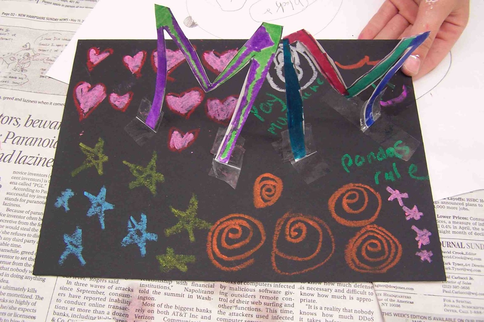
Easy Paper Name Sculpture For DAD

Yep, Father's Day is right around the corner, but don't fret if you haven't made Dear Old Dad a present yet...here's a fun and easy sculpture you can make for him that will look nice on his desk or toolbox (that's how the dads in our family roll). 


This project is based on one I saw on pinterest that had no destination or info--it was pretty much a picture on the internet. I've tried to do it justice, so here's my version. My early finisher students did this one day after painting some other sculptures. I'd say this project takes less than a half an hour to do if you choose an easy word like "dad."I'd love to have my students create multi-leveled sculptures with their entire names (more letters = a more exciting sculpture), but that's for another time!

Paper Name Sculpture For DAD

Supplies Needed:
  • 3" x 5" index cards, white on both sides (one for each letter of the name you choose)
  • Pencil
  • Scissors
  • Markers
  • Clear Tape
  • Mat Board, we used black
  • Oil Pastels
Directions:

1. Draw nice, thick letters onto the index cards making them as big as you can (touching all edges of the index card, if possible). Cut out your letters with scissors.

2. Decorate both sides of each letter with markers. Use at least two colors on each side of every letter. Try using different patterns and colors for each letter--have fun!

3. Use clear tape to attach the letters to the mat board so they stand up. Make your letters touch and lean against one another, if you'd like. The more letters you have, the more elaborate your sculpture will be. You can even make your sculpture go up vertically if you have enough letters. Think of building this sculpture like you would build a house of cards with a deck of playing cards, but you can hold the letters together with clear tape (bonus!).

4. Once all of your letters are taped where you'd like them, use the oil pastels or craypas to write a message on the base such as "I Love You!" or "Dad Rocks!" The decorate the rest of the base with the oil pastels with swirls, lines, and patterns.

Now you have a colorful sculpture for Dad! Enjoy!


Some students made sculptures with their initials instead.

And this student made a sculpture for his dog, Lulu!

Wednesday, April 10, 2013

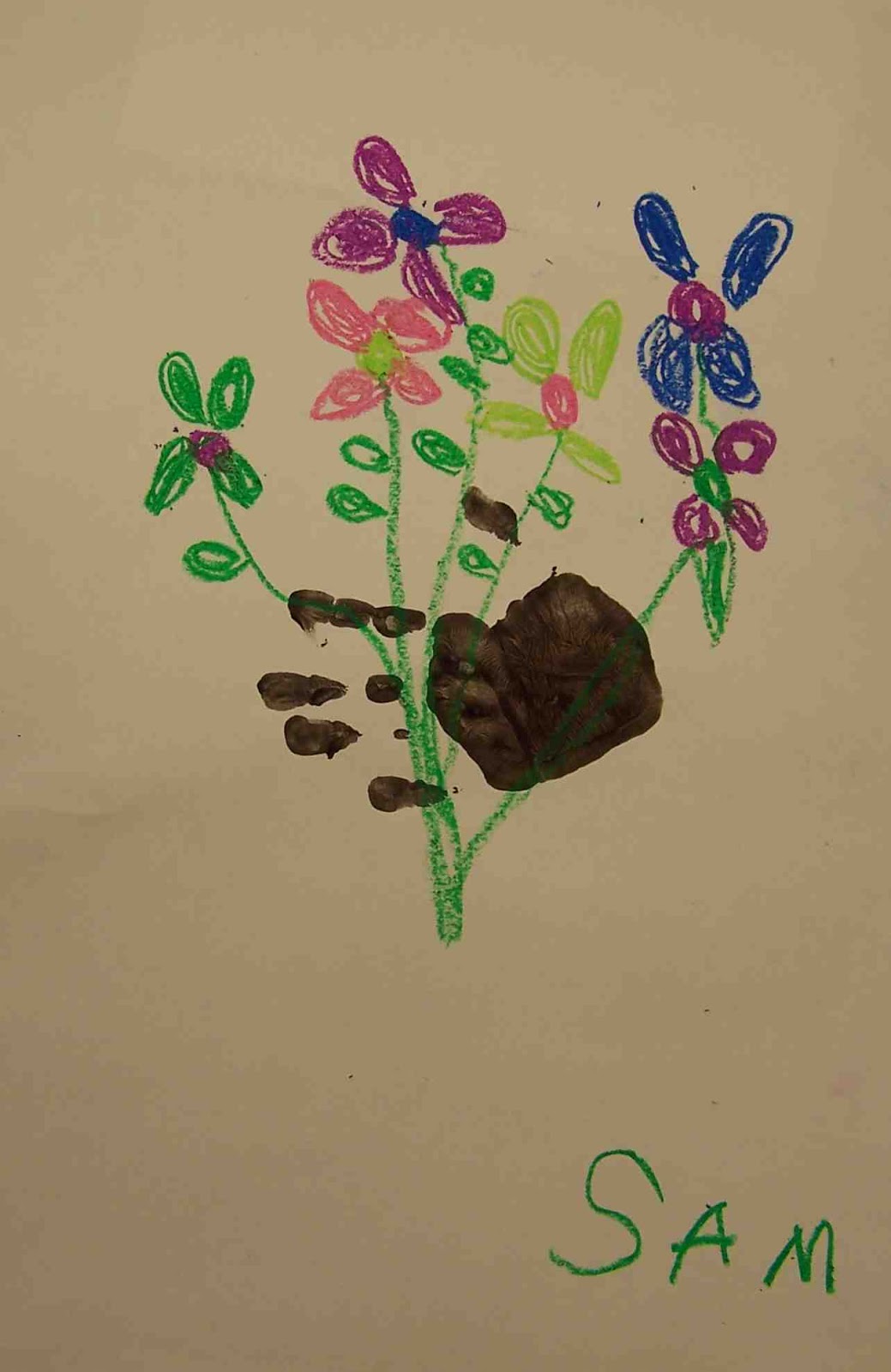
Kinder Picasso "Hand With Bouquet"

I've been visiting the Kinders at a local school (Clark Elementary in Amherst, NH) once a month doing an art enrichment program. I usually tie in a book or music or fine art (and sometimes all three) to make the experience a rich and multi-layered one. I have absolutely LOVED working with the children--Kinders are so cool. They are up for anything and so smart!


We've done some fall- and winter-themed art, but Spring is here! So I thought we'd create a piece that celebrates warm weather, flowers and color! I'm not a huge Picasso fan, but when I saw the piece "Hand With Bouquet" I immediately thought the children would love it. I experimented a bit with using cut paper and paper muffin liners to make a daffodil bouquet (which came out fine), but then I saw this version on the blog "Splish, Splash, Splatter." Rebecca uses the child's hand print as the hand holding the bouquet--WOW! Now, I'm a mom and anything that has a handprint in it instantly gets a place in my heart (and on the wall). It was a no-brainer--this was gonna happen!

But, I have to say, I was a bit worried about handprints and Kinders and only having a half hour per session...but it went great! We have a small sink in the art room, so I brought in two plastic bins, filled them with water, and had the children wash their hands in those. This allowed all 18 kids (or so) to wash their hands in about 5-7 minutes. I had a grown-up helper at the bins keeping an eye on things-I'm sure that helped!

I am so thrilled with the results and so were the kiddos! This lesson was fun and inexpensive and has a great "WOW" factor. It would be lovely for Mother's Day, too. I particularly enjoyed painting my own hand and then giving each student a high five before they printed their hand on the paper (that allowed me to check that they had covered their entire hand in paint and make sure they placed their hand properly on the page). I think the children thought I was silly-but it was so fun!

Here's how we did these colorful pieces:

Kinder Picasso "Hand With Bouquet"

Supplies Needed:

  • One 12" x 18" piece of white construction paper
  • Paintbrush
  • Paper plate for palette
  • Black tempera
  • Oil pastels/cray pas (assorted colors, but you'll definitely need green)
Directions:

1. Paint your palm, thumb and fingers with the paintbrush and black tempera paint. Make sure you get a nice coat on your hand and go all the way to the tips of your fingers. Press your hand onto the white paper, leaving a handprint. The handprint should be perpendicular to the page. Now you can wash your hand.

2. Look at the picture of Picasso's "Hand With Bouquet." How does he make the flowers? What shapes does he use? Turn your paper so the thumb is up. Check out the examples to see what I mean. This gives a more realistic idea of the hand "holding" the flowers.
Our inspiration:
"Hand With Bouquet" by Pablo Picasso
I instructed the children to use the craypas to draw a large circle for the center of their flower and then color it in. Then add petals going around the center. Use whatever colors you want, but make 4-5 flowers on the area of the paper above the hand.

3. Then add the stems. They should go from each flower, to the hand, and out the other side. Add a couple of leaves to make your bouquet look realistic.

4. Don't forget to sign your work like Picasso, using a craypas.

Welcome spring!


Monday, February 4, 2013

More Miros

Last Fall I posted a Roll-a-Miro project. I just did this project again with my after school Modern Art class and here are the results--ENJOY!

P.S. If you have been thinking about doing this project but haven't yet, please do! The children really have fun with it!

P.P.S. The link to the Roll-a-Miro chart on Pinterest is here (I haven't been able to find the original source for this):

Creatures From Smoo 57

The Angels of the Ocean

The Angel of the Sky

The Amazing World of Squiggle

The Animal World
The Evil Squidwards

Tuesday, December 18, 2012

Artsonia Ornament Picture How-To

I saw this project on Artsonia and thought my students would love to make this, and guess what? I did too! I made this along side one of my private art students and it was fun and easy and I love the contrast and graphic look of the piece.


Ornaments and Evergreen Picture

Supplies Needed:

  • Scraps of watercolor paper 
  • A circular object to trace--I used a glass (our circles are about 2 1/2" in diameter)
  • Pencil
  • Watercolor paints and brushes
  • White watercolor pencil or crayon
  • Water bucket and paper towels
  • Black mat board
  • Oil Pastels
  • Tacky glue
  • Gold and silver Prismacolor colored pencils
Directions:

1. Use the pencil to trace the circular object onto your watercolor paper about four to five times. Trace lightly. It is better to have a couple more circles than you'll use, just in case.

2. Use the watercolor crayon to add the highlights to each of the ornaments.

3. Wet the entire circle of an ornament. Use the watercolors to create juicy, saturated colors on the ornaments, letting the water blend the colors (wet on wet technique). Use your brush to blend the colors into the highlight a bit to soften the edges. Try to use three colors per ornament--choosing colors that are next to each other on the color wheel (analogous) so that they blend nicely. Repeat with all of the ornaments. Let dry.

4. Use the oil pastels to create the branches of the evergreens. I had my student start with the brown part of the branches. Use a chocolate brown first and rough in the branch. Then go over the branch with a lighter brown (like a yellow ochre) for the highlights. 

5. Use the oil pastels to create the needles of the evergreen. Start with a dark emerald green and rough in some of the needles. Then layer on the medium kelly green color for the bulk of the needles. Finally, use a light moss green for the highlights. Remember to make the needles start at the branch and curve toward the tip of the branch, the way real evergreen needles do.

6. Glue the ornaments onto the background. you may need to place a book on top of them to keep them from curling.

7. Use the gold colored pencil to add the top of the ornament (the finial?) and the hook. Use the silver to create a bit of highlight on the gold.

Merry Christmas!
Related Posts Plugin for WordPress, Blogger...