Pages

Saturday, August 29, 2015

Grade 6 Oil Pastel Fauve Landscapes

Well, I fell in love with these great oil pastels I found in art room of the middle school I was working at. They are chunky and water soluble--Um, hello!?! Water soluble OIL pastels? I do not understand the mysteries of the world, but I must say, my students and I used the bejeebies out of these last semester! 


This shows the stages of the project: Image selection, simplified sketch
and completed Fauve Landscape.

One great project the 6th graders worked on was Fauve landscapes. I have posted a Fauve Landscape project before which was more technical and science-oriented since it involved afterimages and such (check it out here--it makes a grew STEAM project). But this time, I went with a simpler version that still allowed the students to learn about the Fauves and color theory. These came out beautiful and made a wonderful display, but I didn't get a picture of them all together (I know, I can't believe it). Trust me, they are awesome and beautiful. :-)

Here's how it worked:
Students looked through the magazines in the classroom for three landscapes they liked that they thought would work to simplify--these oil pastels don't do detail well. The students met with me and we discussed their choices and they selected one to take to final. They could then simplify the landscape on newsprint using a grid format (or freehand it if they preferred).

Once they were done their draft, I had them transfer the image to a poster-weight paper. I thought that would hold up well. However, you could probably use white drawing paper. Students were encouraged to use at least two colors in each section of their drawing using blending. We had talked about color theory, warm/cool colors and atmospheric perspective so they could make great color choices. Once all of the sections of their landscape were complete, they could use a dark-colored pastel to outlines the sections (similar the some of the Fauve artists).

When done, the finished pieces were glued to a black mat (black paper cut 2" larger than the work). This really made the colors seem so bright and also made the pieces look more finished. Matting work just makes it seem more special.

Ta-da! Beautiful Fauve Landscapes! ENJOY!

Wednesday, August 26, 2015

1 Point Perspective Shapes of AWESOMENESS

Ok, so this is a pretty basic 1 point perspective draw-a-long that I did with my 6th grade students. This was left by the art teacher for me to do with the students as their first project of the semester. Since it could be a little dry, I starting calling it "Shapes of AWESOMENESS" and used a super-hero-type voice that really inspired awe in my students :-) or maybe they were worried I had lost my marbles!


One of the students made me this--Thank you!

Anyhoo, this was a great way for them to learn the basics of perspective drawing such as horizon line, vanishing point, height, width, depth, facing size, construction lines, etc. They were able to draw geometric shapes, organic shapes, and letters. I encouraged the students to place their shapes and letters above and below the horizon line.

Once they practiced drawing a variety of shapes and letters on their "Shapes of Awesomeness" test sheet, I gave them another, smaller piece of paper and they could draw their names using what they had learned. They drew with pencil, outlined with Sharpie, then shaded with colored pencils.

My super-smart students then suggested we glue the finished names to their folders (duh, Mrs. P, why didn't you think of that!?!) and that's what we did. The teacher I was subbing for uses basic two-pocket folders for students to hold class paperwork and smaller projects in-the-works and these fit nicely on the cover.

Enjoy!

Monday, August 24, 2015

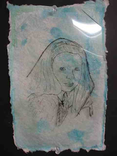
Not-So-Scary Self Portrait Project

Many of my students dread the self portrait. I find that the older they get the more fear and loathing I see when I mention "self portrait." Not to fear! I was finishing up with last semester's 6th grade students and tried this neat twist on the self portrait from Dali's Moustache that uses clear acetate sheets (overhead projector film)--we had a surplus of them in the classroom, but I've also used sheet protectors (but those are more costly).


The students were pretty happy with the results, although some of them took a couple tries to get the hang of the drawing/tracing technique. We used watercolor paper and watercolors for our backgrounds.

I also saw this other version that uses collage for the background and I'm going to try that next time. Thanks, Janet Taylor for the awesome idea--I love collage!

ENJOY!!


And the bulletin board display of some of the completed self-portraits.

Wednesday, August 19, 2015

FREE ART BOOK GIVEAWAY!

We all can use a little inspiration, can't we?

I have some WONDERFUL news to share: SIX art ideas of mine have been published in the book "500 Kids Art Ideas" by Gavin Andrews published by Quarry Books! 


This soft-cover book is chock-full of great ideas that will really get your creativity going! There are eleven different chapters in the book that show full color pictures of a variety of art media and projects created by a wide range of ages. There are great ideas for working in felts, fibers, paper and book art, sculpture and 3D, technology and more!

It truly is a beautiful book! Each of the 500 projects has a full color illustration along with a quick list of materials used. While there aren't step-by-step directions for each project, there's enough information to get you started and art teachers, homeschoolers and creative kiddos will be inspired none-the-less.

Author Gavin Andrews is an art educator and artist who is currently employed at the Peabody Essex Museum in Salem, Massachusetts. I love what is written about her on Amazon (on the "About the Author" section for this book), "She is dedicated to the role of art and creativity in people's lives, especially those of her two children, and strives to have people understand that everyone can be creative." I couldn't agree with her more!

Want a copy? Well, I have one right here for you! I'm giving away a FREE copy of the book "500 Kids Art Ideas" by Gavin Andrews published by Quarry Books in my first-eva giveaway! Here are the details:

If you would like to be entered in the drawing to receive a copy of the book, leave a comment below with your name, email address and let me know what book YOU can't live without in your classroom or one that you've read that inspired you. 

I will choose a winner at random on August 31st, 2015. Sorry, only those in the continental United States are eligible for this giveaway.

So, get to writing that comment below to enter! Good luck!

Tuesday, August 18, 2015

Sculpture with Grade 5? It's a piece of cake!

The school I was substitute teaching at was celebrating its 40th birthday while I was there. Naturally, I had to have the students create some yummy cake-themed art in celebration! I decided on a Wayne Thiebaud theme for two of the grades. Grade 5 made these awesome 3D papier mache and collage cakes frosted with (get ready) shaving cream mixed with Elmer's glue. Yeah, I know, kind of crazy--but it was AWESOME!!!


Let's get ready to PARTY! Cakes, cakes & more cakes!! YUM!

I got the idea for these cakes from Mrs. Hahn at Mini Matisse and the students had a blast creating these. This was a great project because it used up lots of little bits of paper, sequins, beads and more and allowed the students TONS of creativity. We received so many compliments on them and they truly looked good enough to eat! Definitely a keeper!

ENJOY!!


Friday, August 14, 2015

REPOST: Symmetrical Paper and Clay Butterflies

It's been a long summer here in New Hampshire--my kiddos have been on break since June 10th and don't start school again until September 8th--WOW! So, the long and lazy days of summer need some crafting with mom time. Here's a butterfly that Little Miss did today. This is a post from back in September of 2012, but it's a good one--very fun (and shhh....educational too!). ENJOY!


And here's the original post:

Do you know some students who are studying butterflies? This is a great project for children in Kindergarten and elementary school. You can work in so many great concepts with this project: parts of an insect, symmetry, pattern, and more.


I started by having my students cut out the wings and design them and then I walked them through the making of the butterfly body. We finished up by adding the details such as antennae and legs. I really enjoyed this project because it taught science and art concepts, but it also because it allowed the students some self expression; a win/win in my book!

Clay Butterfly With Paper Wings

Supplies Needed:

  • One 6" x 9" piece of construction paper for the wings (light color)
  • Pencil with eraser
  • Scissors
  • Assorted markers
  • Model Magic by Crayola (about the size of a chicken egg), whatever color you want
  • 3 pipe cleaners (chenille stems), whatever color you want

Directions:

1. Fold the construction paper in half the short way (hamburger or taco fold).

2. Arrange the construction paper so the fold is on the left. Draw a capital letter "B" on the paper extending it so the top and bottom of the "B" touch the top and bottom of the paper.

3. Cut out the "B" shape, but don't cut the middle line (in between the upper and bottom bumps). Write your name on the paper and open it up so your name is face down. These are your butterfly wings.

4. Decorate the wings with whatever designs you would like: big dots, little dots, lines, etc. I showed a couple of butterfly books to the children before they started drawing. I asked them to make their designs symmetrical, or the same on both wings.

5. I then gave each child a ball of Model Magic the size of a chicken egg. I had them pull off a piece and roll it into a 3/4-1" ball. This is the butterfly's head. Place this ball of dough at the top of your butterfly's wings and press down slightly.

6. Divide the remainder of the dough in half (two equal parts). Form he first into a ball. This is the thorax for your butterfly. Place this ball of dough below your butterfly's head on the wings and press down slightly.

7. Roll the remainder of the dough into a hot dog shape about 3" long or so. This is the abdomen of your butterfly. Place this ball of dough below your butterfly's thorax on the wings and press down slightly.

8. Use scissors to cut each pipe cleaner into three equal sections. Poke 2 pipe cleaner pieces into the butterfly's head as his antennae. Wrap another pipe cleaner piece into a coil and poke it into the head for the butterfly's proboscis.

9. Poke the remaining 6 pipe cleaner pieces into the butterfly's thorax (3 on one side, 3 on the other). These are the butterfly's legs.

You're done! Enjoy your colorful butterfly!

Thursday, August 13, 2015

Grade 5 Tooled Metal Lines and Patterns

My fifth grade students loved this great little project. We talked about different types of lines (dotted, straight, curved, dashed, etc.) and pattern. I gave the students four little 3 1/2" square pieces of white paper and they could create little compositions that included line and pattern.

Once they were done, they selected one of their compositions to tool into metal. This is a very neat media to work with and this relief technique is called repoussé which is French for "to push back." You can get the tooling foil online at Dick Blick. It is quite reasonably priced--I was able to get enough 3 1/2" and 4" squares for multiple classes from one roll with some left over.  The foil is easy to cut and use (I use a box cutter but you can use scissors too). To make the marks, I have students use a dull pencil on the metal while it is on a piece of felt that has been folded in half to make a double-thickness. Sometimes students need to go over their lines twice to make a nice, deep mark, but otherwise students have a high rate of success with this media. 

Once the metal portion of the project was done, I gave each student an 8" x 10" piece of mat board and they could take a pencil and extend the patterns and lines beyond the metal square over the surface of the mat board. They then colored the lines and patterns on the mat board with oil pastels. Once done, we hot glued the metal squares to the mat board. 

I think they came out beautiful!

Students could place the tooled metal square wherever they liked
on the mat board (in the center, off to the side, etc.). They then used
color, line and pattern to fill up the space.

The students were VERY engaged during this project and loved the results. The photos don't do them justice--they are beautiful and colorful. ENJOY!


The partially completed bulletin board that shows the variety of the work.
BEAUTIFUL!

When they were done, I had them affix all four of their design squares (the preliminary sketches they did on paper) to a worksheet and fill out a self-assessment on the back.


P.S. For additional tooled metal projects, check out my Mexican Folk Art Ornaments and Mexican Folk Art Trinket Boxes

Tuesday, August 11, 2015

Planning Your Classroom Design? Look at this research...

Well, I've been busy this summer taking one of my last Graduate courses--Research Design, and it has been pretty neat. I've actually enjoyed reading about educational research and it's given me some things to think about as I move into my student teaching this Fall (YIPPEE!! SO thrilled!).

If you are blessed to have a teaching job and a classroom to plan, check out this study called, "Visual Environment, Attention Allocation, and Learning in Young Children: When Too Much of a Good Thing May Be Bad" written by Anna V. FisherKarrie E. Godwin and Howard Seltman. This article was originally published in Psychological Science May 2014. 

Here's the Abstract:
A large body of evidence supports the importance of focused attention for encoding and task performance. Yet young children with immature regulation of focused attention are often placed in elementary-school classrooms containing many displays that are not relevant to ongoing instruction. We investigated whether such displays can affect children’s ability to maintain focused attention during instruction and to learn the lesson content. We placed kindergarten children in a laboratory classroom for six introductory science lessons, and we experimentally manipulated the visual environment in the classroom. Children were more distracted by the visual environment, spent more time off task, and demonstrated smaller learning gains when the walls were highly decorated than when the decorations were removed.
(from http://pss.sagepub.com/content/early/2014/05/20/0956797614533801.abstract)

If you don't want to purchase the full article, check out this online write-up from The Association of Psychological Science that summarizes the article.

This study really got me thinking about the visuals that are in the classroom and how they affect student learning. As a graphic designer and a visual person, I get distracted easily by clutter and "stuff" all over surfaces and walls. I also need to be able to know where my supplies are. I felt like this was also true with the students in the middle school art classroom I substituted in this past Spring. I tried hard to organize the classroom to have zones and label drawers and cabinets neatly so that the students (and I) could find things and work efficiently. I also tried to keep visuals to a minimum and have them relate to the project at hand. I think in my future classroom, I would make some adjustments to that even more--I'm always learning!

I hope you enjoy this study as you plan your classroom for the fall!

P.S. If you do want some kick-butt posters for your classroom, check out my free posters here. ;-)