Pages

Wednesday, December 19, 2012

Poinsettia Mosaic Collage

The other day I set out the supplies for my son to make this great poinsettia craft. He's in Kindergarten, so I wanted to give him some tracing, cutting and other fine motor control practice--oh, and he made this nice little piece for the art wall in our dining room. A win/win, I'd say!


I first saw a version of this project this fall, I think, on the blog Panther's Palette written by Pam Speaker. Her version was colorful and I was instantly drawn to it--as was my son who was looking over my shoulder and said, "I want to make THAT!" As he was adding the tissue paper poofs to his original piece, I thought how we could change the colors of the project to make it look like a daffodil for spring. The more I thought about it, I thought it could also make a great daisy or black-eyed susan for the summer, and poinsettia for winter. I'd love to make four of these depicting the four seasons! I'll put it on the neverending to-do list! For now, here's the winter version:

Poinsettia Mosaic Collage

Supplies Needed:

  • 1 9x12" piece of off-white construction paper
  • Red, green, white and yellow construction paper scraps
  • Scrap of card stock, optional
  • Yellow tissue paper, cut into 1" squares
  • Pencil
  • Scissors
  • Glue stick
  • Elmer's glue
  • Little cup for glue
Directions:

1. Glue a strip of green paper onto the page for a stem. Add a circle of yellow in the center of the page for the center of the flower.

2. Create a petal shape on card stock. Trace the petal shape onto the red paper and cut out 6 petals or so. I showed my son how to fold the paper a couple of times, then trace the shape and cut through the entire stack to create multiple petals in one shot. Glue the petals on around the flower's center.

3. Cut some 1/2" strips from red, green and white paper. Staple the strips together at one end. Use the scissors to cut through all of the strips at the same time to make a bunch of little 1/2" squares. Glue these down in a pattern around the outside edge of the piece.

4. Pour a bit of Elmer's glue in a small bowl or tray. Take one of the tissue paper squares and wrap it over the eraser end of the pencil. Dip the tissue paper in the glue and then touch ot to the paper in the center of the flower. Release the tissue paper and it should create a 3D "poof" with the tissue. Repeat as desired. I thought my son would use the tissue paper just in the center of the flower, but he put them on the petals too. Whatever you like...

You can also look up the story, The Legend of the Poinsettia online if you wanted to add a literature/moral/spiritual aspect to this project. Enjoy!

Tuesday, December 18, 2012

Artsonia Ornament Picture How-To

I saw this project on Artsonia and thought my students would love to make this, and guess what? I did too! I made this along side one of my private art students and it was fun and easy and I love the contrast and graphic look of the piece.


Ornaments and Evergreen Picture

Supplies Needed:

  • Scraps of watercolor paper 
  • A circular object to trace--I used a glass (our circles are about 2 1/2" in diameter)
  • Pencil
  • Watercolor paints and brushes
  • White watercolor pencil or crayon
  • Water bucket and paper towels
  • Black mat board
  • Oil Pastels
  • Tacky glue
  • Gold and silver Prismacolor colored pencils
Directions:

1. Use the pencil to trace the circular object onto your watercolor paper about four to five times. Trace lightly. It is better to have a couple more circles than you'll use, just in case.

2. Use the watercolor crayon to add the highlights to each of the ornaments.

3. Wet the entire circle of an ornament. Use the watercolors to create juicy, saturated colors on the ornaments, letting the water blend the colors (wet on wet technique). Use your brush to blend the colors into the highlight a bit to soften the edges. Try to use three colors per ornament--choosing colors that are next to each other on the color wheel (analogous) so that they blend nicely. Repeat with all of the ornaments. Let dry.

4. Use the oil pastels to create the branches of the evergreens. I had my student start with the brown part of the branches. Use a chocolate brown first and rough in the branch. Then go over the branch with a lighter brown (like a yellow ochre) for the highlights. 

5. Use the oil pastels to create the needles of the evergreen. Start with a dark emerald green and rough in some of the needles. Then layer on the medium kelly green color for the bulk of the needles. Finally, use a light moss green for the highlights. Remember to make the needles start at the branch and curve toward the tip of the branch, the way real evergreen needles do.

6. Glue the ornaments onto the background. you may need to place a book on top of them to keep them from curling.

7. Use the gold colored pencil to add the top of the ornament (the finial?) and the hook. Use the silver to create a bit of highlight on the gold.

Merry Christmas!

Friday, December 14, 2012

Matching Mittens and Printmaking Snowflakes

This week, I had the great opportunity to spend time with the PM Kinders at Clark School. They were so great and really excited to be creating some winter-themed art! 


Matching patterns and lots of different snowflakes using
a variety of found materials.

We began by talking about how cold winter is and how we need to dress warmly. We talked about the different things that we should wear when going outside to play during winter , including hats, boots, warm socks, and mittens! I told them that we were going to create mittens that matched, or that were a pair.

How were we going to do this? Collage. That's where we take bits of paper and make a picture with it. Some famous illustrators who do this are Lois Elhert and Eric Carle. I had a couple of books on hand to show: "Feathers For Lunch" and "A Pair of Socks," all illustrated by Elhert were perfect. I even mentioned the fine artist Henri Matisse and how his collage pictures are famous and sell for millions. WOW!

We went to the tables and crafted our mittens, making sure that both of our mittens matched (both in pattern and color choices). This is a great way for children to learn some math concepts and critical thinking skills. Creating a unique pattern and then matching it is quite an accomplishment!

Then they could move over to the "Snow Table" and experiment with different items I had brought in to stamp and make snow. This was a fun lesson in basic printmaking, and the children enjoyed experimenting with the different "stamps."


Patterned Mittens

Supplies Needed:
  • 1 12x18" piece of black paper
  • 1  6x9" piece of construction paper, whatever color you chose for mittens
  • Paper scraps, various colors (I had multiple colors available in 1/2" strips, 1" strips, and little 2"x3" pieces they could cut shapes from
  • Pencil
  • Glue stick
  • Scissors
  • Paint tray
  • White tempera paint
  • Assorted stamps, see below
Directions:

1. Create your stamps. You don't need anything fancy for this part. I had some plain wine corks, some pom poms hot glued to corks, and some sprigs of evergreen tree branches. I also made some fancier stamps with some foam snowflakes I found at Michael's hot glued to corks.

2. Fold the 6x9" piece of construction paper in half (the hamburger fold) and trace the child's hand onto the paper. Go around all of the fingers at once, like a mitten. Cut along the tracing line, through both thicknesses of the paper, to make two mittens that are alike.

3. Use the scraps of paper and the paper lines to create a pattern on your mittens. You can use lines and shapes such as squares, rectangles, circles, and triangles. Make sure that whatever design you do on one mitten is done on the other mitten.

4.  When your mittens are done, glue them to the black background paper.

5. Dip the stamps in the white tempera paint and add snow all over the background. Try out different stamps. The sprigs of evergreen looked great if the students stamped the tips onto the page, but some tried stamping the sprigs sideways, and that looked really neat, too. Pom poms gave a lovely, fuzzy snowflake, and some of the children were purists and used the stamps that had the foam snowflake shapes glued to them. 

They turned out great! I was also thinking of adding hats next time and/or a little string of yarn going from one mitten to the other. That would look so cute! I had a lovely time hanging out with these kiddos!

ENJOY!


Sunday, December 9, 2012

(Plastic) Chestnuts Roasting On An Open Fire....

OK, so this is an art blog, but I had to show you all this very cool LEGO fireplace my oldest son and I built last night! Hey, it could be considered a sculpture!


We found the directions online to build a fireplace "frame" from Legos and then you insert your iPod (or other such device) into the side with the "Eternal Flame" app playing on it. There's even the sound of the crackling fire!

When we were done, our whole family gathered around our new fireplace and enjoyed the view. My son then took the mini fireplace up to his room and fell asleep to the crackling fire! How cute!

Now, to make some Lego stocking to hang on the mantel...

Friday, December 7, 2012

To Brighten Your Day: Frank Lloyd Wright Windows

My Modern Art Class created some lovely faux stained glass windows based on the work of American architect, Frank Lloyd Wright. I've done this project with students before, and the process can be seen in this post.

This time, I tweaked my presentation a bit. I showed a large poster of Fallingwater, one of Wright's most famous houses. I talked about what an architect does, and about Wright's design philosophy. We made some observations about the building and I pointed out the horizontal, vertical & diagonal lines of the building (later on, I showed how these same lines appear in his stained glass windows).

Then we discussed how Wright was, um, a bit of a control freak when it came to his interior designs. He designed every little pillow, lamp, rug and even the dishes that would go into the house. We looked at some of his stained glass window designs. I was fortunate to have a great article that I have had FOREVER, well, since 1995 anyway, that appeared in American Patchwork & Quilting Magazine about a quilter named Jackie Robinson, who recreates Wright's stained glass windows in fabric. This is an awesome article because it shows how she constructs the quilts and really helps the children see the windows broken down into sections; leading vs. glass, and shapes such as squares, rectangles, rhombi, and triangles. I think this article really helped me simplify his work for the children.

I tried to access the article through the American Patchwork & Quilting's official site, but they didn't have it available. However, Jackie Robinson has her own site called Animas Quilts Publishing. Robinson had published an entire book of quilt designs based on Wright's stained glass windows titled, "Quilts In The Tradition of Frank Lloyd Wright." It is currrently out of print, but there are a few copies still floating around out there. There is a Frank Lloyd Wright section of her site showing examples of Wright-inspired quilts made from her book.

So, here are the beautiful results of my Frank Lloyd Wright lesson! Enjoy!


Thursday, December 6, 2012

Pinterest Party 2012!

My friends are too busy to get together over the holidays. They work, they have children, they have large families with lots of commitments. Me too, but sometimes going without seeing or talking to my friends for two months, or so, is too long! Friends are what help me get through all of that everyday stuff and offer me a bit of comic relief--and I certainly need that when I'm up to my eyeballs in "to do's" and tinsel!
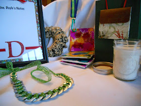
Look at this LOOT!
I mean, look at all of these presents I was able to make...
I could have had a cookie swap, but I didn't want the stale cookies or calories. I could have had a gift swap, but that didn't seem right either. So, I had a Pinterest Party. Here's how it worked:

How It Works:
I invited 7 of my crafty friends. I asked that they choose an easy, gift-worthy craft from Pinterest, make a sample of it and bring the supplies needed to make 7 more. Making a sample beforehand let us know what we'd be making and allows the person to work all of the kinks out beforehand. I asked that they only spend $20-$25 total for all of the supplies necessary to make their craft. Then, the plan was for us to all get together, eat, drink and craft and go home with one of seven different crafty gifts.

I also asked that they bring a snack, drink or dessert from Pinterest to share.

What I Did To Prepare:
Along with making my own craft, I made sure I had a few tables on hand for us to craft on (instead of my one little dining room table). It's great to have some basic supplies like a hot glue gun, scissors, glue sticks, extra ribbon in various sizes and colors (I just grabbed my ribbon bin) and tape. Having a cleaning spray, paper towels and dustpan and broom easily accessible will also help when you need to tidy between projects.

I think next year I will have a gift bag station for wrapping the gifts and a dedicated place for people to put their gifts as they finish them (maybe a large gift bag or grocery bag with handles).

I also set up a group board on Pinterest and invited all of my guests to pin their craft and food item so that, after the party, we'd have access to the directions and recipes, if needed. Our Board is here.

The Projects:
Wow! I was so thrilled at the diversity of the projects! Here's what we made:

  • Alcohol Ink Coasters (set of 4)
  • Birdseed Wreaths
  • Mason Jar Soy Candles
  • Terrariums in a Glass Ornament
  • Desktop Dry Erase Board
  • No-Sew Lanyards
  • Washer Necklaces

We took turns having the person who brought a specific project lead the rest of us through it in a mini tutorial. We learned so much about so many different types of crafts and we were able to try things that we might otherwise have never done.
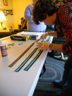
Working on the No-Sew Lanyards
The Food:
YUM! Too many good things and WAY too much food! But I enjoyed working my way through the buffet! I had coffee and tea on hand as well as juice spritzers. One of my good friends brought eggnog from a local dairy. These are some of the recipes from Pinterest that were there (Check out the Pin Board for the links/recipes):

  • Pumpkin Whoopie Pies
  • Candy Cane Dip With Apples & Oreos for dipping
  • Asian Slaw With Ginger-Peanut Dressing
  • Buffalo Chicken Enchilada Roll-ups
  • Goat Cheese Stuffed Bacon Wrapped Dates
  • Seven Layer Bars
  • Hummus & Salsa with veggies and chips, etc.
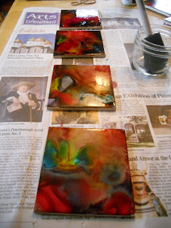
Some of the coasters drying--these really brighten up
after they are sprayed with the sealant.
Some Thoughts:
If you think you'd enjoy a Pinny Party, do it! It was fun and it's great to come away with lots of little gifts for giving. It does take some advance planning since you have to give your guests time to come up with an idea, try it at home, and shop for the supplies to create enough for your guests.

We had allowed three hours for the party (from 1:00-4:00 on a Sunday afternoon). That really wasn't enough time. Have your guests think of how they can prep some of their supplies ahead of time to save time and try to keep each project to about 1/2 hour. Limiting the guest list to 4-6 can help with time, but who wants to limit the guest list too much! Maybe if the party is held a bit earlier in the year (mid-November?) and there are two evenings of crafting (3-4 projects and evening) then that would allow for more time and more fun. But I wouldn't try to hold a party with two sessions in December--much too crazy!

But I LOVE the projects we made and I'm worried I won't be able to part with them! I'm so thrilled I was able to spend time with my friends and have some crafting therapy! I may not be entirely ready to face the holidays, but when things get stressful, I'll try to remember the good time I had with my friends this weekend.
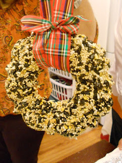
And a present for our feathered friends, too!

Monday, December 3, 2012

Story-Telling Animal Pelts

For week three of my Tribal Art of North America after school art class, I thought we'd do a project I saw over at Sleepyhead Design Studio. This is similar to my cave painting project, but easier to do with a larger group (no lacing the piece to a twig frame) and A LOT LESS MESSY! Yee haw!


We followed Sleepyhead's project instructions and prepped our pelts (crumpling and rubbing the paper bag to create a fuzzy, wrinkled texture) and then the children used Sharpies to cover the pelts with symbols (I had printed out some symbol sheets for them to refer to). They were encouraged to create their own symbols, too--I just had them add their symbols to the sheet and label their symbols with the meaning.

When doing a test run at home, my children just placed random symbols all over their pelts, but my students chose to use the symbols to tell a story or talk about the things they like (animals, nature, nice weather, etc.). If I were to create one of these, I think I would talk about when my family and I went camping this summer since many of the symbols on the "Picture Dictionary" sheet could be transferred to a story of a camping trip.

Once the children were done creating the symbols on their pelts, I had them use acrylic craft paints and tiny paintbrushes to add color to their pieces. We used a limited color palette: black, brown, ochre, white and turquoise. My art students argued that green and red could also be made from natural ingredients, so I let them have those too. Sleepyhead used oil pastels to add color in her project--that works well, too (I tried both in my samples). Then we mounted the pelts to a 12" x 18" piece of construction paper using a few staples (probably not authentic) and glued the "Picture Dictionary" page of symbols onto the back of the piece using a glue stick. This way, the children wouldn't have to worry if they forgot the meaning for some of the symbols.

I did this project with children in Kindergarten through grade 4 and they all enjoyed it. It's a keeper!

Soap Carving and a Collaborative Totem Pole

In my Tribal Art of North America class, we were able to do a fun technique that the students always enjoy: soap carving. I've done soap carving with my students before when I taught Inuit carvings (see my original  post here). This time, I thought the children could carve the soap and work together to make a totem pole.


The completed Totem Pole--each of the students
created a section (one animal). I placed them on
a background that looked like sky just to snap the picture.

I found a great handout online about totem poles. It gave some background information as well as great images of some typical animals that appear on totem poles along with a description about the symbolism of each animal. The children chose one of the animals to replicate in soap and began carving with their tools: a vegetable peeler, plastic spoon and a toothpick. Features such as beaks, tongues and wings that protruded far away from the main carving were added later using craft foam. I had a sheet of white craft foam on hand for these "extras," but encouraged the children to do most of their carving in the soap.

Detail of the BEAR (symbol of power on the earth).
The tongue is made with a bit of craft foam.

Once the children were done carving their individual totem animals, we put them together into one totem pole and I snapped a picture. The children took their individual pieces of the totem pole home, but before they left, they had enough time to create a second carving of their choosing that was more like the Inuit. We had a great discussion of how different their two sculptures were: the totem was more of a shallow carving meant to be viewed from a very limited radius, but the Inuit-inspired carving was meant to be held and seen from all angles. The carving was much more intense on the Inuit piece in that they had to think about removing the excess and accurately carving their animal on a variety of planes.

And here's one of the Inuit carvings: a polar bear.
These soap carvings are hard to take pictures of
with my camera--sorry they are blurry!
The children did a great job! ENJOY!


Tuesday, November 27, 2012

Christmas Is Early: New Books For Me! YAY!

I love books and I love reading. That being said, I don't own a ton of books. You wanna know why? Besides the fact that we live in a little house, I am, ahem, cheap. Why pay all that money for a book to use for one or two lessons a couple times a year and then have it collect dust (and take up valuable shelf space) the rest of the time? 


YAY! Merry Christmas to me!
(Thanks, mom!)
Exactly.

That's why I love the library! I keep extensive records of all of the books I use for reference for my projects and I never pass up an opportunity to add to that list. My library card is the most important card I carry in my wallet. I constantly used intra-library loans and I am always toting stacks and stacks of books around. Borrowing from the library is so easy! I can browse and make my requests from home and then pick them up and go.

But, sometimes I take a book out over and over again and my late fines start to approach the actual cost of the book. and I'vr referred to it so often that I have a Post-it note on every other page. That's when I know it's time to buy.

These are a few gems that I just added to my collection:

  • "Only One You," by Linda Kranz (Picture book for children) Neat painted "fish" rocks and inspirational sayings/words of wisdom.
  • "Uncle Andy's," by James Warhola (Children's book about Andy Warhol)--I like how the author (who is related to Warhol), really brings this quirky artist to life. It's also a lovely book about finding inspiration (for artwork, for what you want to do in life) around you. I love to see the little boy in the book drawing in his room because he was inspired by his Uncle.

So I'll be enjoying my early Christmas here in New Hampshire. Feel free to write in the comments what YOUR must-have book(s) are...


Thursday, November 15, 2012

Magical Fauve Landscapes

Every year I teach my students about color theory and the color wheel. This year, we're focusing on Modern Art, so I thought a perfect color-theory tie in would be learning about the Fauves. The Fauves (or Wild Beasts) are a bunch of radical artists that created some bright and beautiful pieces of artwork that didn't quite match up with the colors of reality.


I know these landscapes are pretty basic, but read the post to find out why...

I have always loved the work of the Fauves! When I was in college, I used to take this great book called "Fauve Landscape," by Judi Freeman out of my school library. The paintings just made me happy and after I renewed the book at least three times, I decided I needed to own it! I pulled the book off the shelf for this project, and it was full of inspiration for the kiddos.

I began my lesson by having the children fill in a basic color wheel. My standard 6-color color wheel worksheet allows the children to learn about primary, secondary, complementary, warm and cool colors. There was a bit of grumbling about doing the worksheet (some of my students had done this before), but understanding the color wheel is really important for this project to be a success.

Then we looked at examples of works by the Fauves (and artists that are sometimes classified as Fauvists). We had a discussion about the paintings (the colors that were used and how they make us feel, why the artists might have chosen to use the colors they did, etc.).

Then we moved on to the main project. This project was one I saved pre-Pinterest. It is from the book "Art is Fundamental," by Eileen Prince and I always thought my students would enjoy it. In short, students create a simple landscape scene using complementary colors for the objects in the scene. Prince suggests doing the lesson as a draw-along, so that's why all of our pictures look alike. This is a great project because it only needs one piece of paper, a pencil and markers. Having the color wheel on hand really helps them get the idea of complementary colors. By the end of the lesson, they were pros!

Once they are done coloring their scene with nice, solid color, students stare at the completed image for about 30 seconds and then quickly look at the white surface. If done correctly, they will see an afterimage of the scene with the colors appearing properly. It took some of the students a couple of tries to see the afterimage, but most of them were able to see it.

This project didn't impress some of my students as much as I thought it would, but I think I'll keep it in the curriculum because it is a great lesson on color theory and some really cool artists. I also think it is a great lesson to teach children about creating art "in your own way."

The white space on the lower portion is the "white field"
the children look at to see the afterimage.

Nice, solid colors are key to this project.

This project is like a "art vocab ninja"!
The children don't even realize they are learning so much
about color, landscapes, and Modern art.


Sunday, November 11, 2012

Amherst PTA Online Auction Has Begun!

YAY! The day is here! The Amherst PTA's Online Auction has begun. This is a wonderful fundraiser for our local schools and there are so many wonderful things to kick-start your Holiday Shopping. Click here to enter the auction site and browse. The auction ends promptly November 17th at 11:00pm ET.


There are categories such as:

  • Fun At School (lunch with principals and teachers, etc.)
  • We Love Sports (karate lessons, etc)
  • Eat, Drink and Be Merry (Wine, GC at Restaurants)
  • Pamper Yourself (Gift baskets, jewelry, etc.)
  • Let's Go Shopping! (More GC's, etc.)
  • More Great Stuff (Classes and items for yourself and for giving)


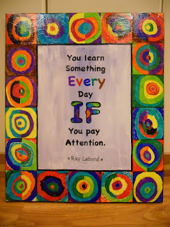
I donated two things to the auction: the first is the Kandinsky-inspired canvas with the learning quote "You Learn Something EVERY Day IF You Pay Attention." This is perfect for home or classroom! We can all use a reminder to pay attention, right? NOTE: If someone outside of driving distance to Amherst, NH (say, over 30 miles--but still in the continental U.S.) is the winning bidder of this piece, I'll pay to ship it to you.

The other thing I donated is full tuition for my "Gifts From The Art" Class held in Amherst at Wilkin's Elementary School in December 2012. This is a fun 2-day class where children can create art-inspired gifts for their family and friends for the holidays. It really is a blast and the children create all sorts of amazing pieces. This one you'll have to be in Amherst to attend. Right now, this class is open to 2nd-4th graders. Here's the post about last year's class.

Both of my items are in the "More Great Stuff" category.

OK, so there's my commercial--get bidding!

Friday, November 9, 2012

Giacometti-Inspired Dancing Figures

Just wanted to share the piece that my private art student did this week in our session about the figure based on Giacometti. This piece is reminiscent of his famous work "City Square," but since my student is a dancer, she chose to make four figures dancing on a stage. This added a lovely dimension to the work in that my student needed to think about how the figures were interacting with one another in the space.

After she was done, she added the shadows and then decided to add skirts to her figures like Degas' "Little Dancer." Wow, this little girl is one smart cookie! What a lovely connection.

Fabulous piece!

"Dancing Figures"
This piece is inspired by a lesson in a previous post. Click here, to see my post on the Giacometti Figure Study.

Saturday, November 3, 2012

2012 PTA Auction Item: Colorful Learning Quote

Our local PTA is great! They provide so many wonderful enrichment programs at my childrens' schools. Since I have three children in school, I feel it is my duty to help the PTA with their fundraising efforts. The online auction allows me to help in a way that is easy for me. Last year, I went into my oldest son's classroom and helped them create a piece as a group to donate. They learned about mosaics and math and created a beautiful piece that raised $50 for the PTA.

This year, I asked some children to help me create a piece inspired by Kandinsky (one of my favorite artists) which I combined with a learning quote to create a unique and colorful piece that should appeal to a wide audience.


Ta da! Here's this year's piece I created
for the Amherst (NH) PTA's Annual Online Auction.
Now to get it to the auction coordinator so she can get it online...
Here's how we created the piece:

First off, I took inspiration from Kathy Barbro at Art Projects For Kids. It was in her blog that I first saw the technique of having children use Sharpies on dry wax paper and then adhering it to canvas. What an awesome idea and I'm so glad she posted it. Really, once you try this technique, you'll be hooked! I bought my dry wax paper at a food service supply store in our town. It came in sheets and it used to wrap sandwiches--it is less waxy than regular wax paper and is thicker than tracing paper.

Kandinsky Inspired PTA Piece

Supplies Needed:
  • Dry wax paper
  • Pencils
  • Sharpies in various colors
  • Scissors and ruler or paper cutter
  • Pre-primed and pre-stretched canvas (or you can use a canvas board), mine is 20" x 24"
  • Mod Podge and paint brush (I used matte Mod Podge while working & the Glossy for the final coat)
  • Acrylic paints (I used black, blue and white)
  • Quote printed out to size needed
Directions:

1. Figure out what size squares you want for your border and how many you need. I needed 18 four inch squares for my border. Cut squares of dry wax paper slightly larger than you need (I cut them to be 4 1/2" so little fingerprints on the edges could be trimmed away for a neater look. You can skip this step and make your squares actual size if you want to--it would save some time later).

2. Use the pencil to draw a circle in the center of the dry wax paper square. Then draw concentric circles radiating from that. The circles don't have to be perfect, it actually looks better if they are imperfect.

3. Use the Sharpies to color in the concentric circles. You can color in the circles entirely with one color, or split a circle and do the left side one color and the right side another color (check out Kandinsky's work and the photos of this project for inspiration). Fill in your entire square with rings of color. 

4. Once all of the squares are done, trim them to the size you need. I trimmed mine to be 4" square.

5. Use a ruler and pencil to measure and lightly draw guidelines to place your border squares. I did a 4" border all around the canvas with little tick marks every four inches so I could make sure I was lining everything up properly as I went.

6. Use Mod Podge to attach the squares to the canvas around the border. I suggest laying out all of your squares first to make sure you like the arrangement before you start gluing. Paint the Mod Podge onto the canvas, lay the dry wax paper square onto the glue and then paint a coat of Mod Podge on top of the square, gently easing the wrinkles and bubbles out. Let dry.

7. At this point, I painted the inner area of the piece. I used white acrylic paint and a touch of blue to create a painterly sky feel. I kept the color choice light since I knew I would be adding words over this area. Feel free to use the color(s) of your choice here.

8. I then painted black acrylic paint on the side edges of the canvas that had not been covered by the dry wax squares border. This makes the piece look more finished and makes it ready to hang--no frame needed! The buyer of this piece will appreciate that. I allowed the black to cover the sides of the canvas and come over the face of the painting a little bit. If you are using a canvas board, you could skip this step, if you wanted.

9. Once the center area is dry, you can add a little inner border of black paint, as I did. Use a thin brush (I used a soft, flat brush that was about 3/16" wide). Let dry.

10. Tape some dry wax paper over the printout of your quote. Trace the letters and fill them in using Sharpie. Cut out the words you traced on the dry wax paper close to the words (I kept all the words on a line together). Adhere the words to the canvas using Mod Podge. Let dry.

11. Once the entire canvas is dry, go over the entire piece with a thin coat of glossy Mod Podge, if desired. This will provide a nice sheen to the piece, sealing everything onto the canvas. Let dry and enjoy!

P.S. If anyone knows who Ray Lablond is, let me know, I tried to look him up online and couldn't find the man that matches the quote. ENJOY!

Friday, October 26, 2012

Foil Giacometti Figures

This week, I had my students create sculptures with foil similar to Giacometti. Foil is inexpensive and easy to mold (and pretty addicting when you get twisting and turning). I also wanted to give the children an opportunity to learn the proportions of the human figure and practice gesture drawing.


Look at those muscles!
We were also able to talk about 3D versus relief and then I introduced Giacometti's work. We had an interesting discussion about how his pieces LOOKED (skinny, stick-like, like a zombie, like they had been burned up like a match-stick) and how they made us FEEL (sad, not sad, scared, uncomfortable).

I saw that another blogger, mccann at Doodles & Noodles, added another dimension to this project by having the children include the shadows of their figures. I thought that was an interesting idea. Not only does it look great visually, but it is interesting to compare the original gesture drawing of the figure to the 3D sculpture and the contour of the shadow.

Giacometti Figure Study

Supplies Needed:

  • A few sheets of 8 1/2" x 11" copy paper
  • Pencil
  • A manikin, if possible (I bought mine at IKEA for $5) and a friend to draw
  • 3-4' section of aluminum foil (I buy mine at the Dollar Store)
  • Hot glue gun and glue sticks
  • Matte board or thick cardboard
  • One 9" x 12" piece of black construction paper
  • Stapler
  • Scissors
  • Glue stick
  • Lamp (we used a flashlight but that moved too much)
Directions:

1. Warm up by drawing a few gesture drawings of the figure in different poses. I talked briefly about the shapes that make up the human figure and how to draw the figure step-by-step. As the students posed, I posed Manny, the manikin, into the same pose so we could talk about the parts of the body and how they were arranged in each pose. I pointed out how the parts of the body joined and how they bent. Many times, young students will add too many joints or make knees bend the wrong way (OUCH!). One of my students asked, "When did this become a science lesson?" And it's true, learning to draw from life forces us to study and learn the structure of objects and beings.

2. Choose a pose to use as inspiration for your sculpture. I gave each student a 3'-4' piece of foil. I demonstrated how to shape a figure from the foil. I suggest scrunching the foil lightly at first to get the overall shape of your figure down and then squishing the foil to be more compact once you have all of the parts figured out. I really encouraged the students to create the figure from the one piece of foil and not pull off bits of foil, make parts, and then try to join them into a figure. Once you have your figure, pose it in the way it should be, using your drawing as a guide.

3. Use the hot glue to tack the figure's feet to the matte board. 

4. Slip a piece of white copy paper under the foil figure's feet in the direction you want your shadow to fall. Place the entire sculpture in front of a lamp or bright light source so that a shadow comes from the foil figure and goes across the white copy paper. Trace the shadow onto the copy paper using pencil. 

5. Compare the contour of the shadow to the gesture drawing you originally made--how are they different? How are they the same?

The elements of the Giacometti Figure Study (clockwise from top):
Manny the manikin, the gesture sketch, the shadow tracing,
 and the completed foil figure.
6. Staple the white copy paper with the shadow on it to a piece of black construction paper. Using your pencil line as a guide, cut through both layers to create a shadow from the black paper. Remove the staples and glue the shadow to the matte board using a glue stick. Note: Make sure you glue your shadow down facing the proper way--some kids tried to glue their shadows on upside down! Also, make sure that you slip a bit of your shadow under the foil figure's feet--shadows start UNDER our feet.

And Yet ANOTHER Science Link: If you had the luxury of time and patience, you could trace your foil figure's shadow throughout the day (say three times?) and cut each shadow from a different color of construction paper and then layer them on the matte board to show the passage of time or how our shadows change as the sun's position changes...just sayin'. That would be pretty awesome! ENJOY!


"Running To A Friend By The Sea"

Wednesday, October 24, 2012

Big Mouth Gargoyles

This past week, in Medieval Art, we explored the 3D art of gargoyles and chimeras. We learned some neat facts such as the name gargoyle means "water spitter" or "water vomiter" which is quite accurate since gargoyles have a gutter where rain is funneled through and then exits their mouths (sometimes the water exits the nose or, ahem, other places). Sculptures that do not have holes for water to travel through are actually called chimera (ki-mare-ah). Gargoyles and chimeras do not have to be scary--we saw some that looked like elephants, sea turtles and even Darth Vader! This art form is a great way for children to explore clay modeling techniques while experimenting with telling a story and expressing emotion in their work.

Love the fangs and curly tail!

We used a technique where the children created a pinch pot with clay first and then flipped it on its side to create the mouth of their gargoyle. This created a large caricature mouth and immediately made their sculpture more expressive. The children then utilized the "scratch and attach" method of using slip (watered down clay) to attach their features to the gargoyles. Since these are made from air dry clay, I took them home to dry and my husband sprayed them with a metallic faux-stone paint to make them look as though they truly are gargoyles carved from stone.


Thus technique of using a pinch pot to make a gargoyle is different than my previous approach. I thought the pinch pot gargoyles were very expressive, and great for a younger group. 

And a big "Thank you" to one of my students who brought in a few gargoyles from his personal collection for us to see firsthand. Seeing gargoyles and chimeras in 3D really helped facilitate the discussion.

Big Mouth Gargoyles

Supplies Needed:
  • Air dry clay (we used Crayola), about the size of a baseball
  • Newspapers and a paper plate for work surface
  • Little cup (for slip)
  • Plastic knife
  • Crayola Marker (one of the thick ones), color not important
  • Toothpick
  • Paint (acrylics, or faux stone spray paint), optional
Directions:

1. Knead the dough to get it more pliable. If it is too dry, dip your fingers in a bit of water. The dough shouldn't be goopy, but it shouldn't crack when you mold it either. Divide the dough in half and put one half aside for now. The ball of dough you are working with should be about the size of a golf ball or an egg. 

2. Using your thumb and pointer finger, gently squeeze the dough to create a pinch pot. The walls of the pinch pot should be thick enough to support its weight, but thin enough so that the piece dries properly (about 1/4" thick is good).

3. Place the pinch pot on its side on the paper plate. This is the mouth of your gargoyle. Feel free to gently manipulate the pinch pot so that the mouth is expressive: a smile, a grimace, a frown. 

4. From your excess clay, pinch off a bit, about the size of a large blueberry. Place it in your little cup with a couple Tablespoons of water. Stir the clay around in the water until it dissolves and makes mud. This is slip and it will help the clay pieces stick together better.

5. Use the rest of your excess clay to form the features and appendages of your gargoyle. Gargoyle parts you may need are: eye(s), ears, a nose (with crazy nostrils), horns, scales down the back, arms, legs, claws, fangs, teeth, tail, and/or wings. The list is endless! Some things to keep in mind when creating your gargoyle parts:
  • Don't make any piece too thin--it will crack as it dries.
  • Legs, arms, wings and tails should touch the pinch pot and/or rest up against each other for support. Parts that stick off the pinch pot too much will get damaged. Have the legs and arms fold up like your gargoyle is crouching and make the tail wrap around the body. Look at pictures of real gargoyles to see how the sculptors handled this challenge.
  • All "parts" need to be attached with slip. To do this, scratch the area you'd like to attach the "part" to the pinch pot, add a dab of slip, and then press the part onto the pinch pot. This will form a nice bond between the pieces of clay. I'm not sure if there is a formal name for this technique, but I use "scratch and attach."
I have my students use the tools they have to create all of the pieces for their gargoyles. The plastic knives are helpful to some students, the toothpick is great for scoring and poking little holes such as the pupils and drawing scales or adding a furry texture to the piece. The Crayola markers are good for rollers (the outside of the marker shaft) or to create circles for eyeballs (the end of the cap). I remind my students to add all of the parts they want to during this session, and when they think they are done I remind them to take a look again and make sure they've added details in the mouth (teeth & tongue), the top of the head (horns and hair) and the back (scales and texture). They can choose what they want to add/disregard, but I want to encourage them to add detail.

6. Once the piece has all of its "parts" on it, put it aside to dry for a few days. 

7. You can leave the sculptures as they are, or paint them. Before painting, I do a once over and hot glue any bits that seem to be falling off. Acrylic paint works well on the dry clay and you could always use a limited palette such as grey, black and white and have the students create their own faux stone look. I had a 50% off coupon for Michael's craft store and wanted to try the faux stone spray paint, so I picked that up. My husband is the spray paint guy, so I had him spray the gargoyles for me.

Note: One can of stone spray paint covered eight sculptures. I think the color we chose (a metallic stone) looked more silver than anything else. I would have liked a more "plain stone" look. Also, this paint is expensive. $5.00 for 8 sculptures is probably a bit much if you were doing this with a large group, but worked with my smaller group.


Great expression--love the two teeth in front!

Cyclops with big claws on the toes. The wings are resting against
the gargoyle's haunches so they are supported.

This student was inspired by some of the animal gargoyles we looked at.
This elephant has lovely ears. It has a trunk and tusks, too
(sorry the picture is kind of blurry).

Monday, October 22, 2012

What a Relief! Monet Waterlilies

Last week my Modern Art class created pictures based on van Gogh's "Starry Night" painting. The focus was on little strokes of color and using MANY colors in each section. It seemed to me that a natural next step would be to learn about Monet. With this project, the students could, again, work from a reproduction in order to increase their awareness of the artist's technique and color choices, and build on what they learned last week.


Monet also used little dashes of color in his work. We used oil pastels to create our dashes of color. I told the children that we weren't doing to connect these dashes with watercolor paint like we did last week in our van Gogh pieces--this week they needed to cover the entire surface of their piece with dashes of color. To make this less daunting, I reduced the size of the paper. I also used a nice blue color of matte board as their "base." This way, if a bit of blue poke through between the dashes, it still looked like water.

Monet also used MANY colors in his work. We listed all the colors we saw in the reproductions in front of us and pretty much determined that we could use all of the oil pastels in our kits (they are a collection of 12 colors). I asked them to try to use every color at least once in their backgrounds. This wasn't a set rule (like my three-colors-in-each-section rule of last week), but I wanted them to try MANY colors.

We then created the lily pads and lilies separately and attached them. The children were open to working in this way since the "collage technique" was similar to the van Gogh pieces they had made the week before. The lilies are created using tissue paper "puffs" and stick out from the background. This is not 3D, since we can't completely walk around the piece and see it from all sides, but is called a relief.

I had never done a lesson like this before, but I was VERY happy with it. I love the dashes of color and the bright hues of the oil pastels!

Monet Water Lily Relief

Supplies Needed:
  • Reproduction of one of Monet's Water Lily Paintings
  • Matte Board scrap in a medium blue (or other watery color), ours were 8" x 10"
  • Ruler
  • Pencil
  • Masking tape
  • Oil pastels (ours were "Cray•pas" brand, a set of 16)
  • Scrap pieces of poster board or white card stock (for lily pads)
  • Scissors
  • Scrap bits of tissues paper in a variety of peach, pink, white, yellow colors (three colors at least)
  • Clear tape
  • Tacky glue
Directions:

1. Use the ruler to create a 1" border around the edge of your matte board--all four sides.

2. Attach pieces of masking tape to the matter board, using your pencil lines as a guide, to create a nice taped "frame" around the edge of the matte board. When you are done, you'll be removing the tape and this will leave a nice clean edge around your piece. **TIP: stick the masking tape strips to your shirt before placing them on the matte board so they loose some of their stickiness and are easier to remove later on.**

3. Begin filling in the background of your piece using the oil pastels. You will want to use little dashes of color--using the end of the oil pastel will give you a nice thick dash. You can change colors and layer dashes over one another. Make sure you aren't scribbling like you do with a crayon--dash, dash, dash...filling in the water and the plants on the edge of the water.

4. Once the background is done, draw three ovals with pencil onto the white card stock. The ovals should be about 1 1/2" wide. These are your lily pads. Fill in the lily pads using at least three colors (ha! I had to say it!). Cut the ovals out and put a little slit in each one coming from one edge into the center. Put aside.

5. Cut or rip three tissue paper squares. They should be of a couple different colors and be around 1 1/2" square. Layer them and pinch the center and give them a twist to make a little "pouf" of tissue paper. This will be your water lily. Insert the twisted tip of the water lily into the slit of the lily pad you created. Tape the point of the tip to the backside of the lily pad with clear tape to secure them together. Repeat with the other lily pads you have created.

6. Put a dab of glue on the back of each lily pad and place them onto the background. If you'd like, you can add some lily pads to the background with oil pastels. This gives the illusion of depth in your picture, but it is not necessary.


Sunday, October 21, 2012

Starry Night, Step-By-Step

Van Gogh is one of the world's most famous artists and it seems that every art educator has his/her own projects already with which they introduce this fabulous artist. There are so many great projects out there and van Gogh's body of work is so large that it was hard for me to choose just one van Gogh-inspired project to do with my Modern Art class. I finally chose van Gogh's "Starry Night." While this is by no means a new and innovative project, I thought it was great. This is how I tackled it with my students:


The basic elements of a Starry Night: sky, buildings, hill, and tree.
We looked at a couple of books about the artist and noticed all of the colors he used in his paintings. We noted that sometimes his color choices didn't even make sense, like when he painted a sky pink! How unusual! We also noticed how he used little dashes or short brush strokes to add color and that our eyes mixed the colors in these areas. These short brush strokes also created movement in his work (similar to how the repetitive lines in our Degas pieces created movement). We also saw that he used VERY thick application of paint in his work--sometimes spreading the paint with a little spatula called a palette knife. WOW!

Poor Vincent sold very few paintings and drawings during his lifetime, because people of the 1890's didn't quite appreciate his vibrant colors. Today his paintings are some of the most famous and most beloved in the world (and sell for millions).

We looked closely at van Gogh's Starry Night and talked about our observations. We then had reproductions of the painting in front of us so we could see how van Gogh would create each section: sky, hill, tree, and buildings. Using the real painting as a guide allows the children to really see the work and bring their own pieces to another level. The children were required to use AT LEAST THREE COLORS in every section they were creating. That pushed them to think of color combos that would work for each section. Some of their color choices were amazing and inspiring.


Van Gogh-Inspired Starry Night

Supplies:
  • Reproduction of van Gogh's "Starry Night"
  • One 9" x 12" piece of watercolor paper
  • Masking Tape
  • Cardboard to tape the watercolor paper to
  • Gold and silver star stickers
  • Crayons 
  • Watercolor paints & brush
  • Water bucket & paper towels
  • Construction paper rectangles: Dark blue, 4 1/2" x 12"; Brown, 4" x 9"; Black, 4 1/2" x 6"
  • Scissors
  • Glue stick
Directions:

1. Tape the watercolor paper to the cardboard on all sides so that the paper doesn't buckle when wet.

2. Use the crayon to draw a moon on the watercolor paper. Make sure your crayon marks are nice a heavy because we'll be adding washes of watercolor and you want them to show up through the watercolor paint.

3. Put 5-6 silver and gold stars on the watercolor paper in the sky area. 

4. Use your crayons to add swirls and dashes all around the moon and stars. Use "Starry Night" as reference. Use at least three colors in these light areas.

5. Use dashes in the dark "blue" area of the sky. Use at least three colors in this sky area. Don't color in the entire sky area with crayon, you'll be filling in the sky in the next step. Keep pressing firmly with the crayon.

6. Once your entire sky has all of the dashes and swirls you want on it, use watercolors to add a yellow glow around the stars and moon. If the yellow is too much for you, dab the paint on the paper with a piece of paper towel. Then add blue paint to the rest of the sky. You can blend the yellow and blue areas of the sky to make a bit of green (that seems to happen in van Gogh's piece). Cover the entire paper with watercolor. The bottom couple of inches will be covered by your construction paper hills, but you don't want to have a gap where the sky ends and your hills begin. Set the sky aside to dry.

7. Create the ground: grab your dark blue construction paper rectangle (4 1/2" x 12"). Use a dark crayon to draw the hills for your painting. Using additional crayons, add dashes of color (at least three colors!) to the hills. You can use a bit of watercolor in streaks as well, but don't soak the paper. Cut the hills out and set aside.

8. Create the cypress tree: grab your brown construction paper rectangle (4" x 9"). Use a dark crayon to draw the tree for your painting. Using additional crayons, add dashes of color (at least three colors!) to the tree. You can use a bit of watercolor in streaks as well, but don't soak the paper. Cut the tree out and set aside.

9. Create the buildings: same deal as steps 7 & 8 above, but use the black paper rectangle (4 1/2" x 6"). You can use at least three colors here as well. The watercolor streaks and crayon will show up on the back paper. I had the children do at least two buildings. Cut them out and set aside.

10. Once your background is dry, glue the hill, tree, and buildings to it.

WOW! You're done! Great job!